This is a fun, exciting topic. Let's get started!
- Mistake 1: Creating a single logo when you should be creating a Branding System.
- Mistake 2: Staring at Screens
- Mistake 3: Expecting that everything that your company stands for to be baked into your new branding system Day 1.
- Mistake 4: Inviting Too Many Opinions
- Mistake 5: Thinking That This Will Be Easy
- Summary
Mistake 1: Creating a single logo when you should be creating a Branding System
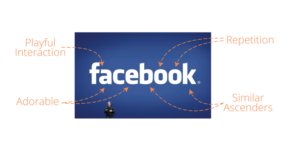
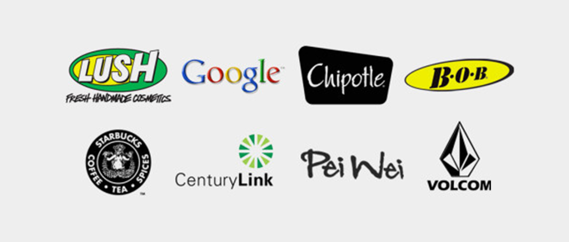
A smart logo usually has two parts: the logomark and the wordmark. Don't get too caught up in those words. Those words have changed before, and they will change again. But here is the concept:
- The logomark is your cool graphic or symbol.
- The wordmark is the name of your company, with stylized letters that make it unique. (FYI, some people call this a typemark.)
- Ideally, your logomark and wordmark can each stand alone. Also, they can stand next to one another and look great together.
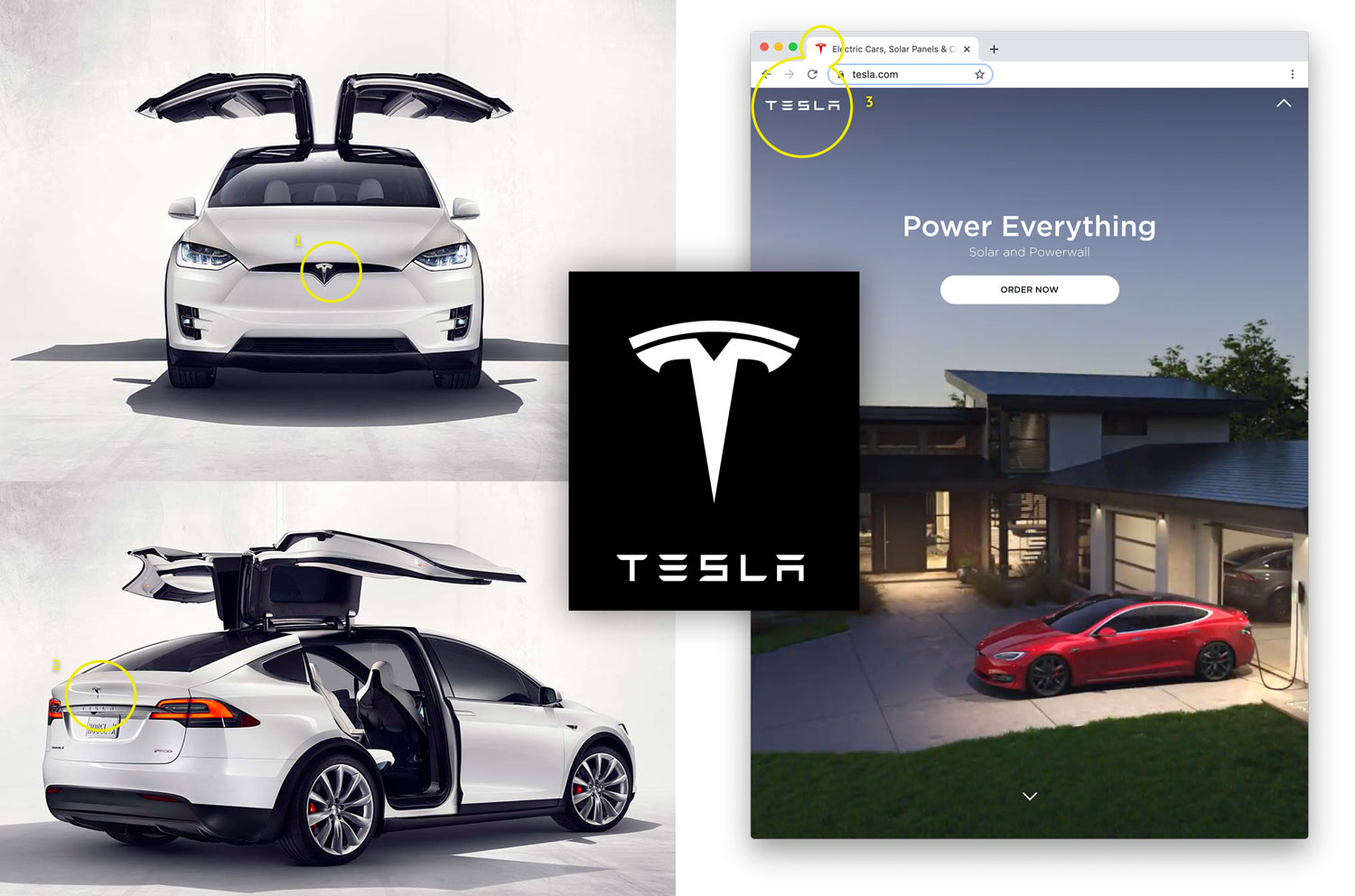
The next time you drive around town, notice on the sides of buildings the logomark and wordmark pairings for each company. You'll see it everywhere. This gives a strong identity, but also gives you flexibility as your company adds new products.
Consider how Tesla now offers cars and residential solar panels. Look again at the images above. The original "T" logomark that you see badging their cars is no longer prominent on their website. Instead, they now use just the "TESLA" wordmark.
Is it enough to have a logomark and a wordmark? You'll be happy if you keep the designer busy to develop a full Branding System. These are some of the visual tools within a good branding system:
- Colors - Some companies have a single color that defines most of what they do (Coca-Cola's red, Snap's yellow), but other companies like having a primary and secondary brand colors. Having colors selected on Day 1 help your company very quickly look cool and consistent on future projects
- Configurations - Your logo should look good everywhere it goes. So you need full-color and single-color logo. Light and dark logo. You need a horizontal logo and vertical logo. Also you need to show how your logo pairs with your slogan, a marketing message, with your web address. This takes time and patience, but you want it to look tight.
- Style Guide - Detailed instructions on how to use the logos, when to use them, how to look cool. This style guide often includes examples and general principals to direct any design or marketing team that needs to use the logos for future projects.
You can get a hint of what's involved with a Branding System by looking at professional sports teams.
What to do: If you have a small budget ($1000 or less), hire the most talented designer you know, even if she is young and lacks experience. Her talent alone will make you look good. But if you have a medium-sized budget (more than $5000), then hire a legit design agency that has experience in branding. They'll make you look so good in so many places.
Mistake 2: Staring at Screens
Glowing logos on a glowing screen can be deceptive. In fact, some of the coolest logos that you find on Pinterest, Dribble, or Behance only look good isolated by themselves on a glowing screen. But that's not where real logos live. Logos are always placed within a brutal context.
Consider the primary location of your logo:
- Is it on the upper-left corner of your website?
- Will it always be crowded next to other information? Against the UI of your app?
- Is it on the side of a building?
- Will it be on the side of a truck driving through the city streets?
- Will it be fixed perfectly on your physical product?
Here's an example for Smith House. I knew that our logo would live primarily on screens. But I wanted to give away some fun company swag. So it was important for me to make sure that the Smith House logomark would look cool on a trucker hat, maybe a hoody. Even better, a logo that looked interesting regardless of the color. Nothing is more powerful than spending $100 and seeing your logo in real life.
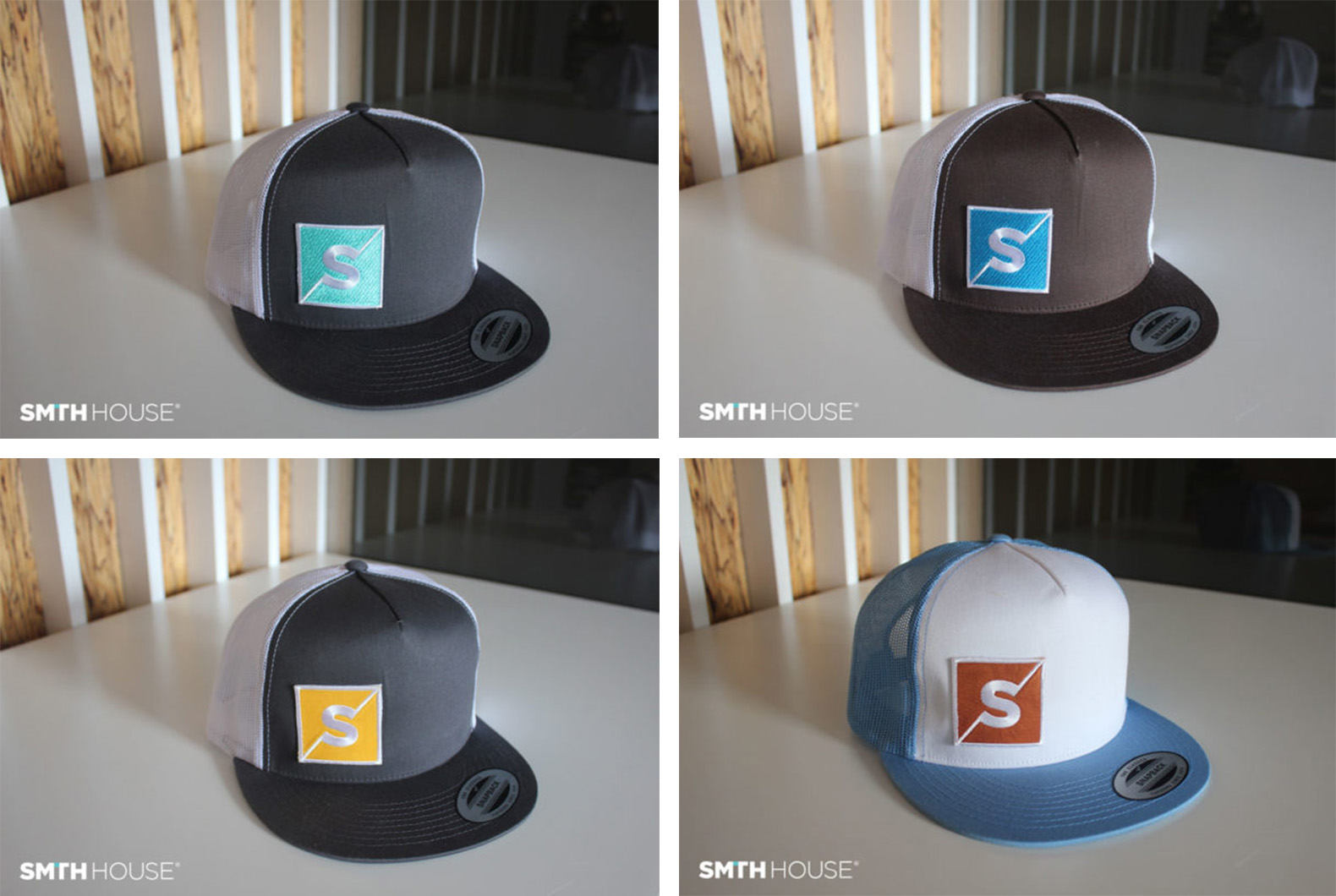
Once you see your logo in a boring/ordinary context, you'll have confidence that it can look good anywhere.
What to do: Ask your designer for print-outs and mockups. Having your logo printed on paper makes it very clear how your company will be represented in our most basic form. If you look good here, you can look good anywhere. Also, ask for mockups so that you can see what your logo will look like on the side of a big truck, or on a cute canvas tote, or as an app icon on a cluttered screen.
Also, through companies like Printful, you can get your logo concepts printed and embroidered on almost anything for a reasonable cost. If you are going to keep this new logo for 10+ years, why not take a few extra steps?
Mistake 3: Expecting that everything that your company stands for to be baked into your new branding system Day 1.
On my desk right now, I have 4 devices badged the Apple logo. (iMac, MacBook Pro, iPhone X, and iPad.)
Today, when we see the Apple logomark, it screams AWESOME! It's the world's most valuable company summarized into a simple little shape. No matter who you are, you wish your company was as awesome as Apple. If you disagree with me, it's because you are in denial.
Skip back a few decades to 1974. On Day 1 of the Apple story when the logo was revealed, was there their fanfare when eyes met the apple with a bite taken out? Was there universal excitement? Did IBM cower in fear of the apple?
Of course not.
Don't expect your whole story to be distilled into a single graphic. That comes with time.
What to do: Adjust your expectation. If you are rebranding a company that is already established, know that a new brand can't capture everything on Day 1. New branding should fit your company and position you well in the marketplace, but it's not magic. Your logo only amplifies your company: your products, your service, your people.
Mistake 4: Inviting Too Many Opinions
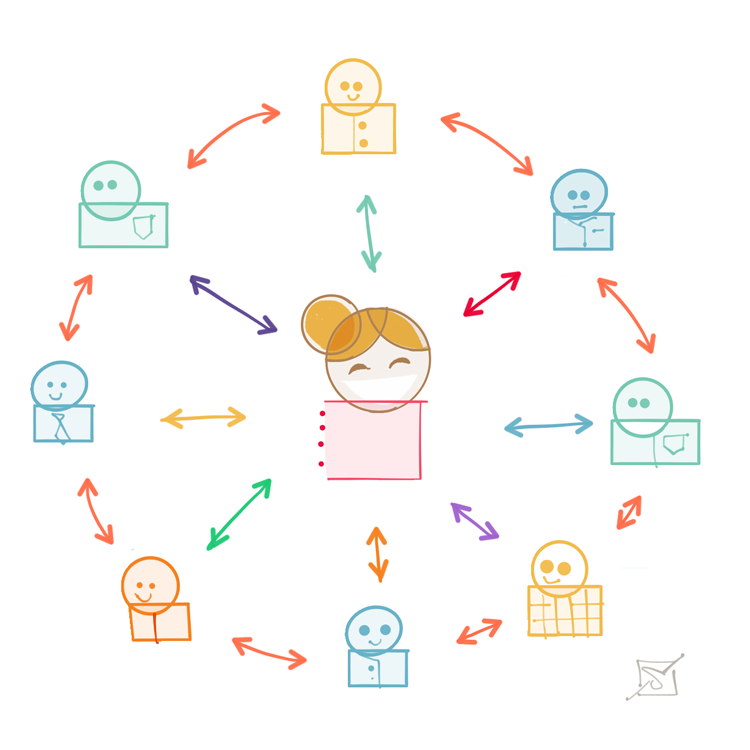
Rebranding your company is a really big deal. You have two audiences to please: your customers, and your staffers.
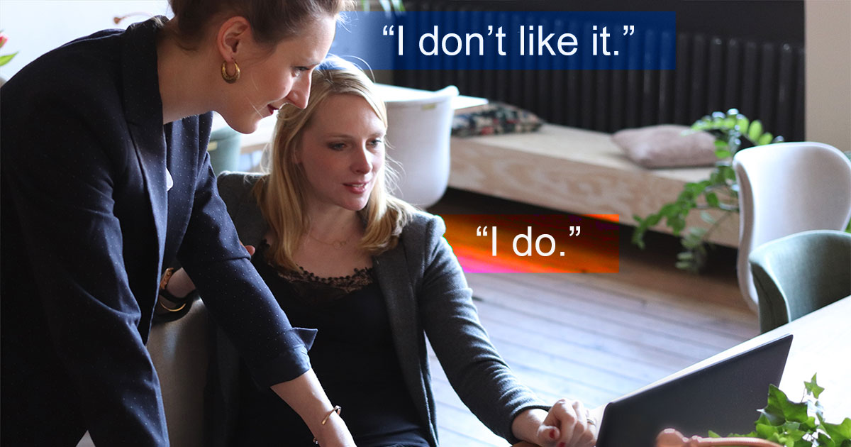
Customers are a tough crowd for sure. But the tougher crowd is the real people in your building. It doesn't matter if you have 2 staffers or 2000, they all will have something to say about your logo and everything that goes with it. If you don't engage your staff in a meaningful way, they can undermine your rebranding project.*
I believe that some of the most infamous design failures (Tropicana, The Gap, Pontiac Aztec) weren't because the designers were bad, it's because their process was broken. Too many people got in the room and shared their opinions. By pleasing everyone, you end up pleasing no one.
That's worth repeating: by pleasing everyone, you please no one. This is true not just for branding. Right now as you read this, there are 1000s of meetings happening in your city. And 25% of those meetings are attached to projects destined to fail because of a broken process.
What to do: There is a smart process, and we'll share it in a future video/resource. Sorry for the tease!
Mistake 5: Thinking That This Will Be Easy
If you are ever charged with creating a branding system for your company, know that these things are just hard:
- It is hard to be cool without looking like you are trying to be cool.
- It is hard to look established without looking boring.
- It is hard to look professional and still be approachable.
- It is hard to look like you belong without looking like everyone else.
These things are hard and you need to be aware of them and navigate through them with a clear mind.
What to Do: Not everything will make sense in the board room. These things take instinct, talent, and hard work. A dedicated team of passionate people. Clear thinkers.
Summary
This was a difficult blog to write because it could turn into a book. It's been difficult to keep the word count low. But since you've made it this far, here's some fun reading to keep the topic going:
8 Logos That Should Have Been Better - Even established companies get it wrong.
Lessons Learned from 3 NBA Teams - A couple of years ago we saw the rebranding of three sports teams, and you can see clearly how they approached the project. You can see the concepts in this blog brought to life.
Logo Scorecard - This is a cool resource (PDF) that you can print out and use it to objectively judge your current logo. It can pinpoint weaknesses so that you know how to improve.
Responsive Logos - This is a fun little website that shows how popular logos (old and new) have many variations for different applications. The key is to resize your browser and watch them change!
*Crazy Things Have Happened - I suggested earlier that your staff can be a tough crowd. Here's an outrageous story worth your time: The Brief and Tumultuous Life of the New University of California Logo


