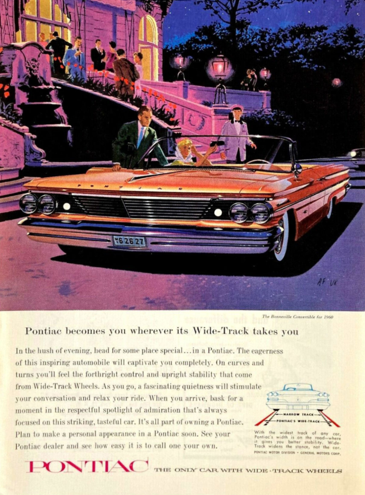
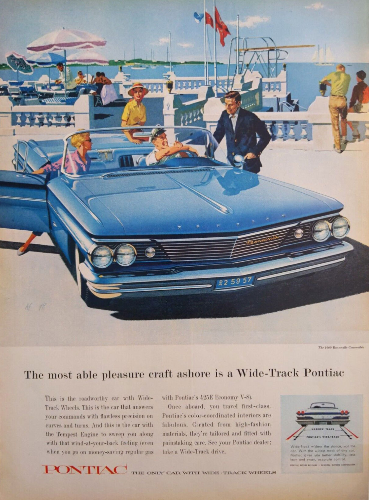
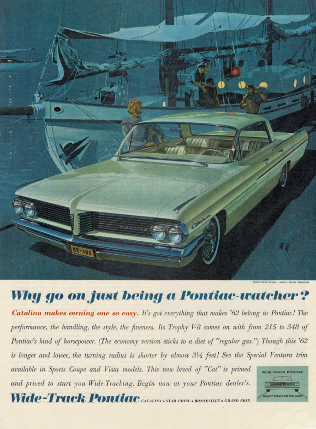
One of my favorite aspects of being a designer is that inspiration can come from anywhere. Website designers can find inspiration from nature, fashion designers can be inspired by architecture, and filmmakers can be inspired by classical paintings. In fact, it’s when you look outside of your medium is when your creativity begins to spark.
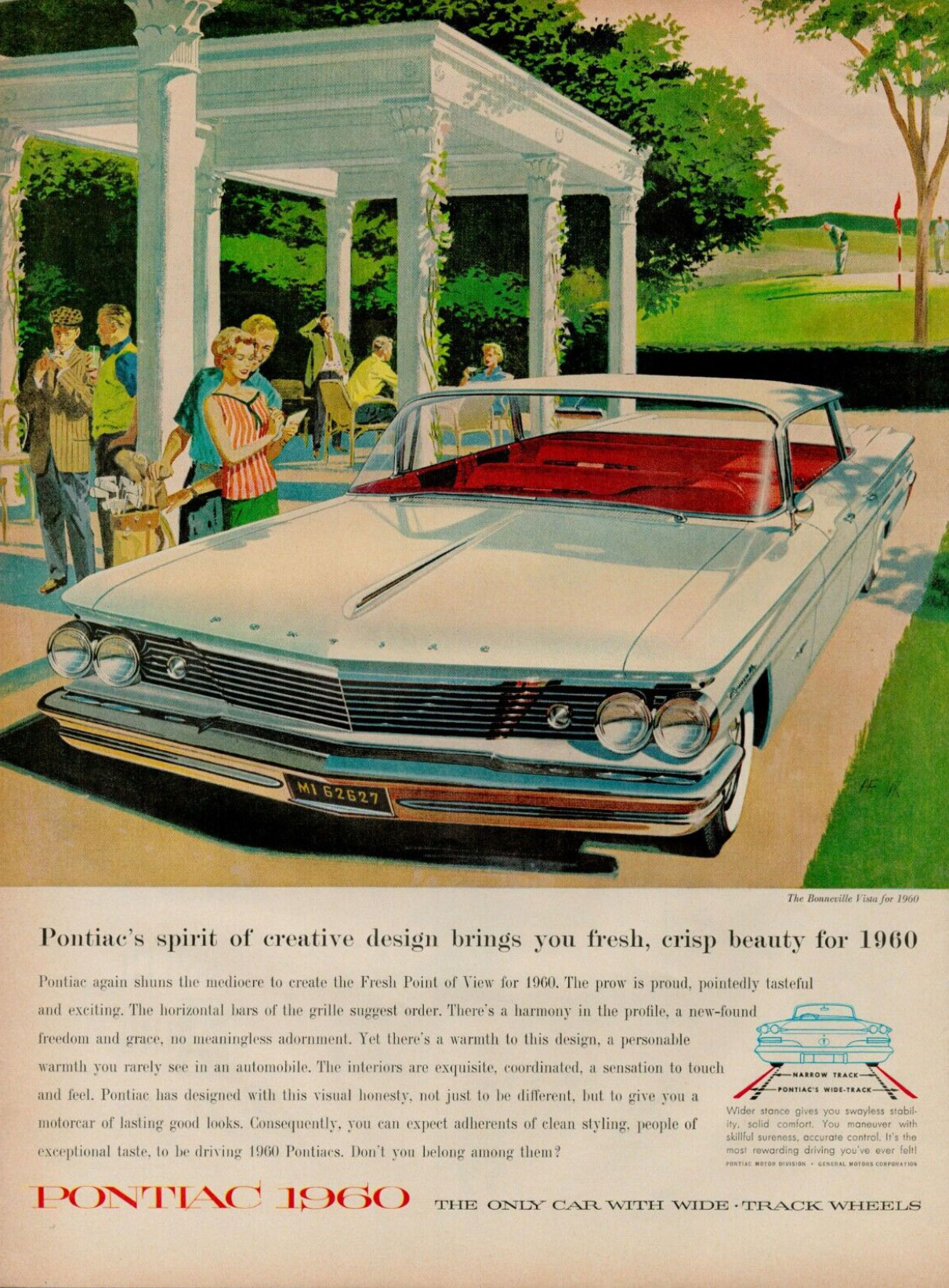
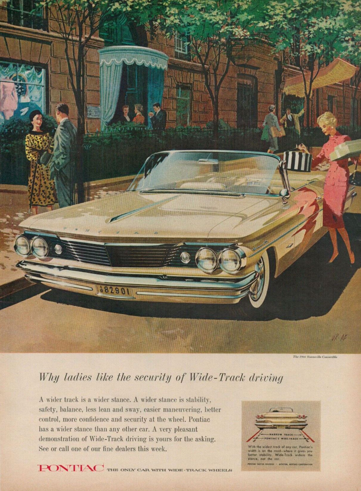
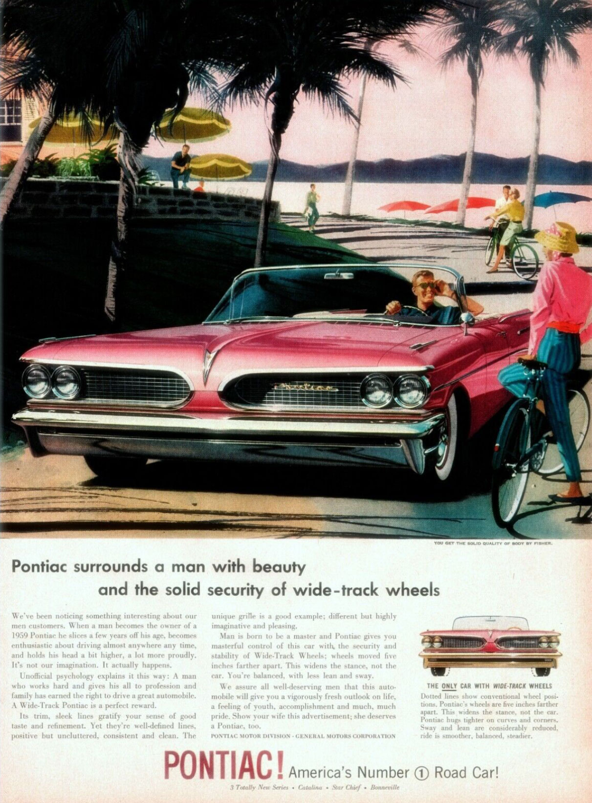
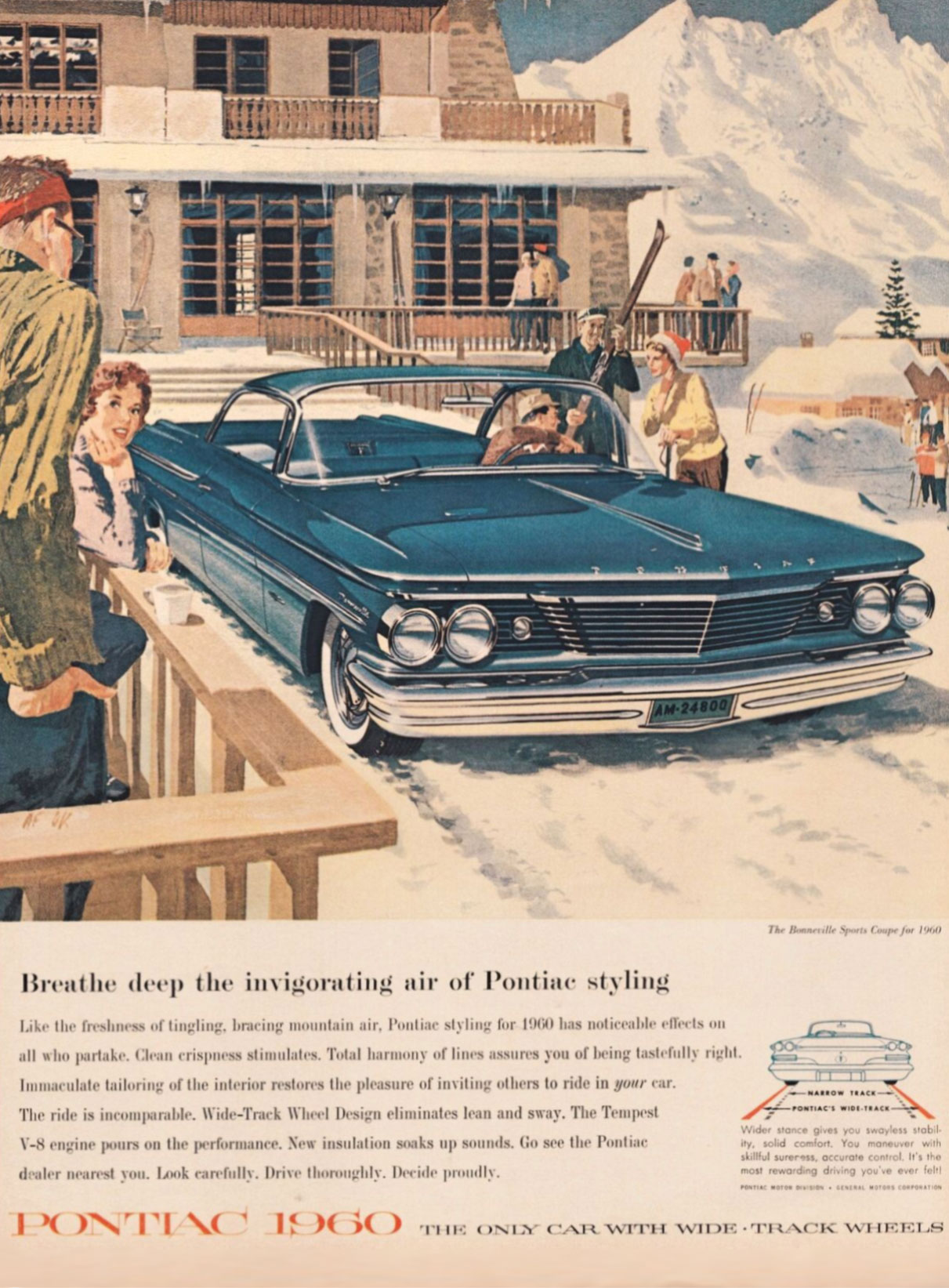
Today on the blog I want to share automobile ads from the early 1960s. These are remarkable illustrations, mostly from commercial artists Art Fritz and Van Kauffman. The colors, composition, and subject matter of these ads are so unique to that era. I would encourage you to read this blog slowly and enjoy the details of each ad. It’s lovely!
I finish this blog with 7 graphic design principles used in this ad that are still applicable today, for both print and web.
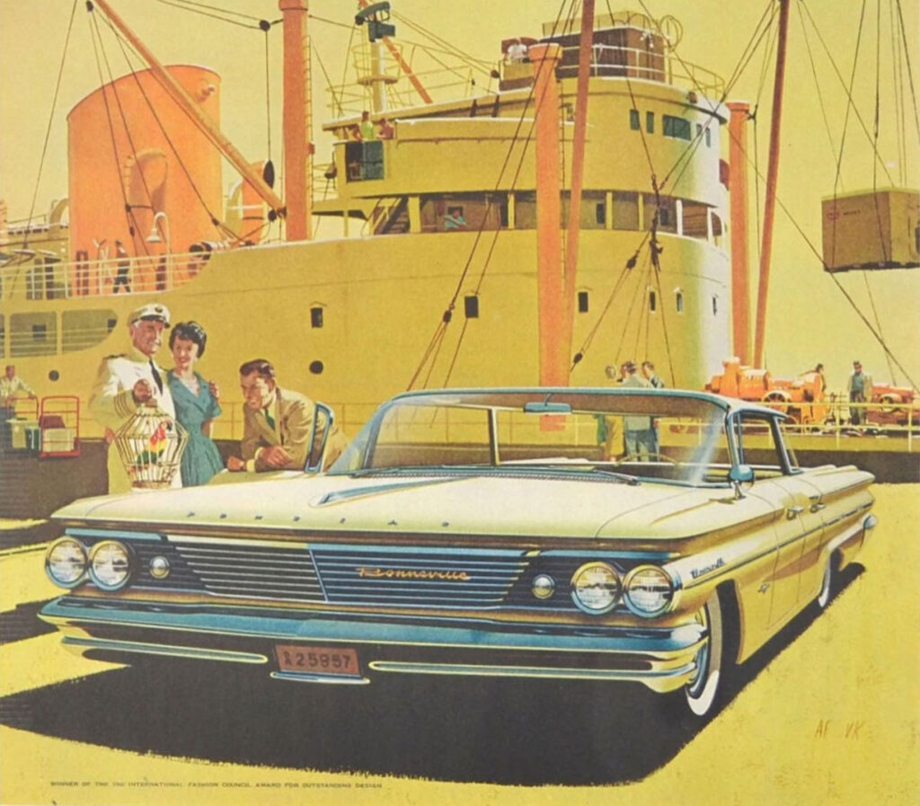
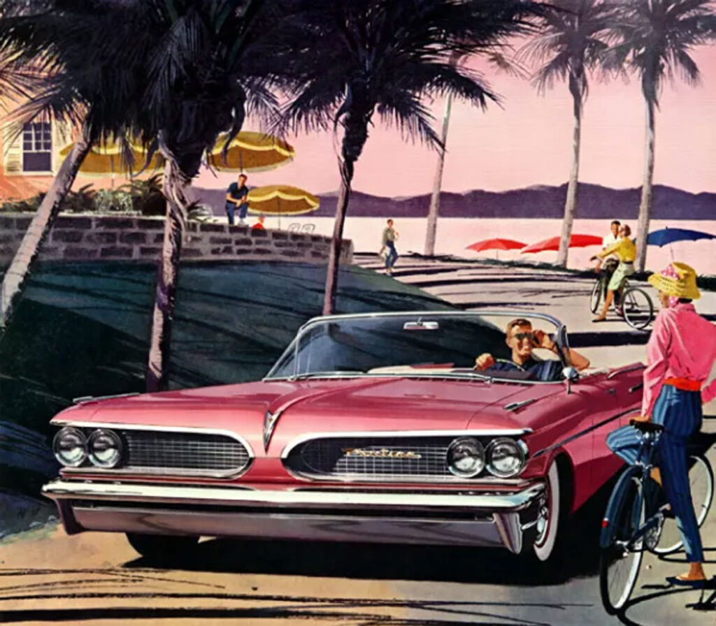
Luxurious Night Life
Let’s talk about composition: how all the stuff fits together on the page. With every ad from Fritz and Kauffman, the car begins in the foreground, pulling right up to you, the reader. It almost drives off the page. The car is the real star.
The background shows you the setting, it sets the ambience. But the “story” is told in the middle ground. Together, the car and the story tell you that others are living better than you, and all you need is to talk to your Pontiac dealer and you can join their club.
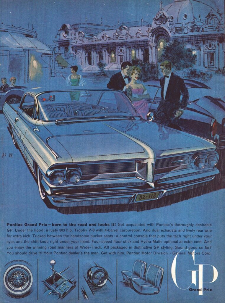
^ The story here is dazzling, isn’t it? Classy couples are leaving an upscale dinner party with friends. On the left, a happy couple in the distance is zooming off in their British roadster. Our lady in green is waving goodbye to those darling friends, soon she will join her date next to his sports car (right).
But our hero couple is the lady in pink and her beau in a tuxedo confidently leaning against his sparkly new Grand Prix. Picture perfect! Everyone I know would sign up for a night out that looks like this! ?
I love the four columns with illustrations at the bottom of the ad. These are beautiful illustrations of key features on the car using gouache, an opaque paint that looks amazing on medium-tone background. Look how fantastic the black and white gouache brings to life the tire, stick shift, speedometer, and seat details!
One final detail of this ad is the placement of the GP logo for Grand Prix. In the West, we read from top to bottom, from left to right. In a 1-page ad, our eye often settles on “finishes” in the lower-right corner, similar to when we read a page in a book. So this is a perfect place for a logo, a web address, or a call to action.
Living in the Fast Lane in Monaco
Now let’s look at this same 1962 Pontiac Grand Prix, but this time as the star in a new story. My guess is that the setting here was inspired by the Grand Prix race in Monaco in the South of France. I’ve never been there, Monaco was the setting for a couple of James Bond movies, recently Casino Royal. Plus, the race is called the Grande Prix, just like our car from Pontiac. ?
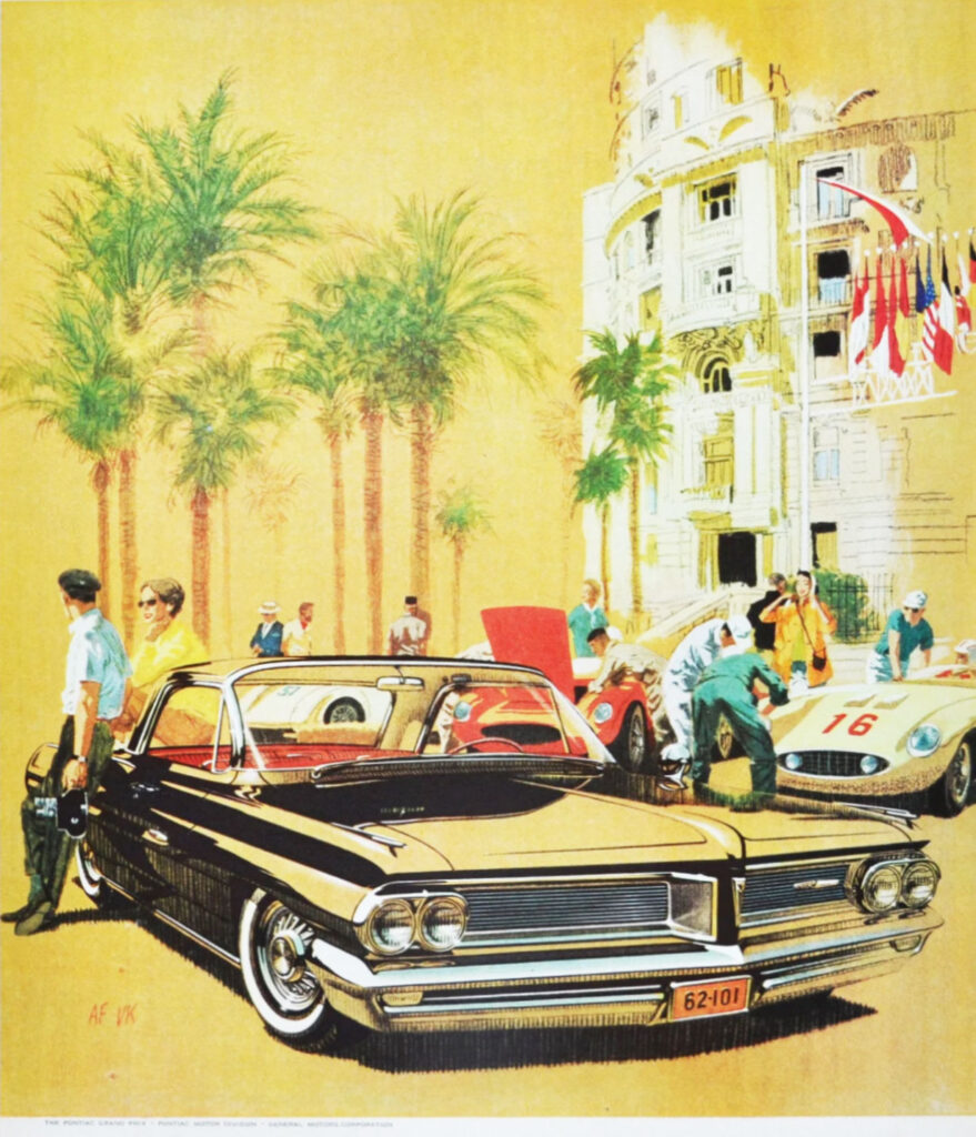
^ Look at the story! In the middle ground (right) you have hoods popped as mechanics wrench on their engines before a race through the winding streets of Monaco. All European sports cars, #16 make me think it’s a Jaguar.
In the middle ground (left), we have a beautiful gal dressed in yellow sitting casually on the long trunk of the Pontiac. Keeping her company is a photographer on a break. Everyone is having a perfect day under the sun. Again–don’t you wish you were there?
What’s interesting in this ad is they chose sunny colors for the story, but a strong black for the Pontiac itself. You can’t stop looking at it!
The Jetset
One of the most distinct marks of automobile design in the late 1950s is the tall tail fins inspired by space travel and the rocket age. The 1957 Chevy Bel Air is probably the most iconic, then maybe the 1959 Cadillacs.
Once the 1960s hit, automobile designers were ready for something new. For the 1961 Bonneville, inspiration came from jet airplanes. Notice the sleek lines and jet-like tail lights of the blue Bonneville.
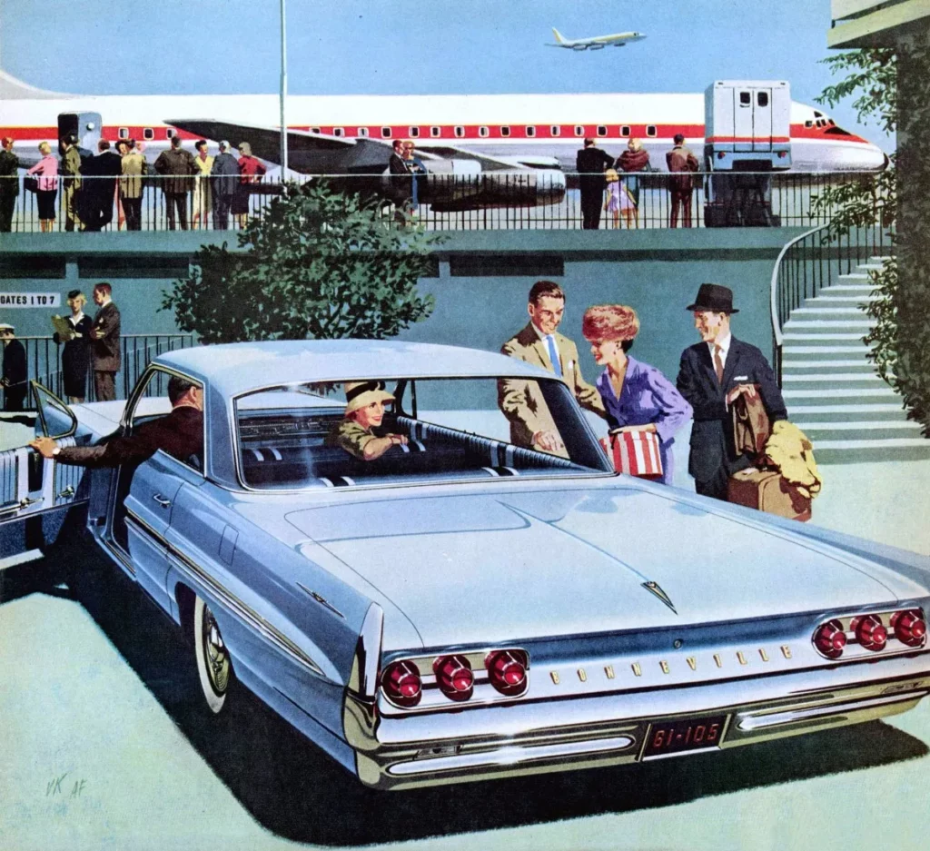
For this ad, let’s talk about Fritz and Kauffman’s use of color. There are three dominant colors in this ad:
- Light blue: sky, the aircraft, the car. This is important! Pontiac wants you to think of the power of a jet engine and the allure of travel.
- Red: taillights, the striped hat box, and the aircraft livery (my first time using that phrase)
- Blue Green: the setting like the stairs, plants, etc.
This seems to be a trend in the work of Fritz and Kauffman: a deliberately limited color palette. Let’s take another look at a different style of 1961 Bonneville, this time the “bubble top” with a cab that’s more defined by glass. Here there are three main colors: green, light brown, and pops of red.
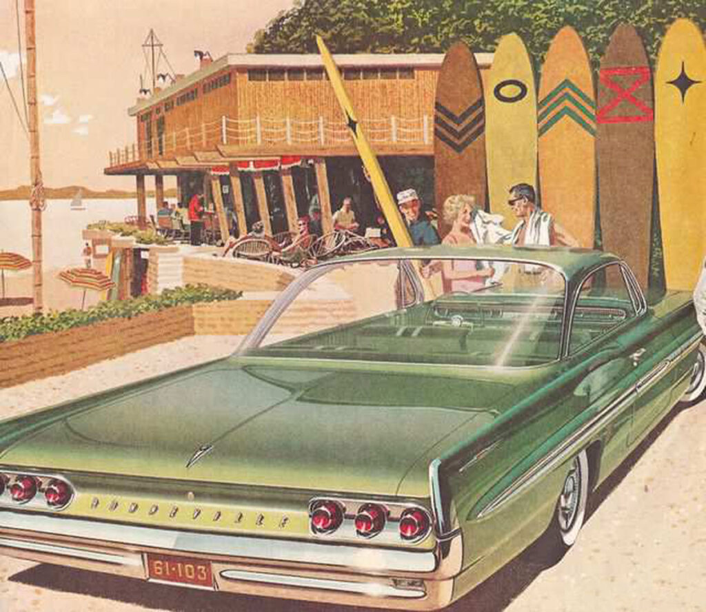
^ Take a look at the graphics on those surfboards. Here we are 50 years later, and those graphics are on trend. In fact, those patterns emerged about 7 years ago by way of Instagram and Pinterest, but today they’re primarily painted on wooden canoe paddles. The paddles are everywhere.
Carefree in the French Alps
This ad puts the American sports car into a story of adventure and far off-destination: the French Alps. Note the French flag, the mountain. A young couple has stopped in this adorable village, maybe to ask for directions. They’re probably loaded ? because they can afford to fly in their American car halfway around the planet. Just for fun.
What’s interesting here is the use of gold tones. These earthy colors would become more popular in the late 60s and early 1970s. Perhaps here in 1964 they were fresh and got everyone excited with these new colors, the loose brush strokes, and the stylized village. Times-are-a-changing!
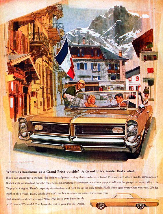
Let’s take a look at the messaging at the bottom of the ad. You can almost hear the 1960s ad voice as you read the headline: “What’s as handsome as a Grand Prix’s outside? A Grand Prix’s inside, that’s what.” Keep reading and you’ll come to a halt with this one: “Ummmmm-uh!” I’ve tried to sound that out with different intonations, and it sounds odd every time. Maybe I should ask someone who was there in the 60s.
Deep down I’m a little jealous of the 1960s people who wrote the copy for these ads like these. I imagine that they didn’t have to work nearly as hard as we do here in the 2020s. Their deadline was what, once a month? Today, we craft new ads each week for Instagram, Facebook, and Google. Plus we have such limited space for your words and graphics.
I imagine in the 1960s, people lounged poolside with a magazine on their lap, flipping slowly through each page as they sipped their Manhattan. Advertisers had hours to make an impression on a potential car buyer. Today? Less than a second. Even with eye-catching videos, people are so eager to swipe past your hard work!
The Suburban Dream
This Ford ad is not as glamorous as the work of Fritz and Kauffman, but there is still so much to love. At the top, we see a blue 1960 Ford Country Squire wagon in a dreamy scene of a family picnic. In a stand of Aspen trees, we have a striped sun canopy shading the picnic table. In the middle ground is a patient dad, unloading gear with his son. Their daughter plays safely inside the roomy new 1960 wagon, maybe she’s fiddling with the FM radio?
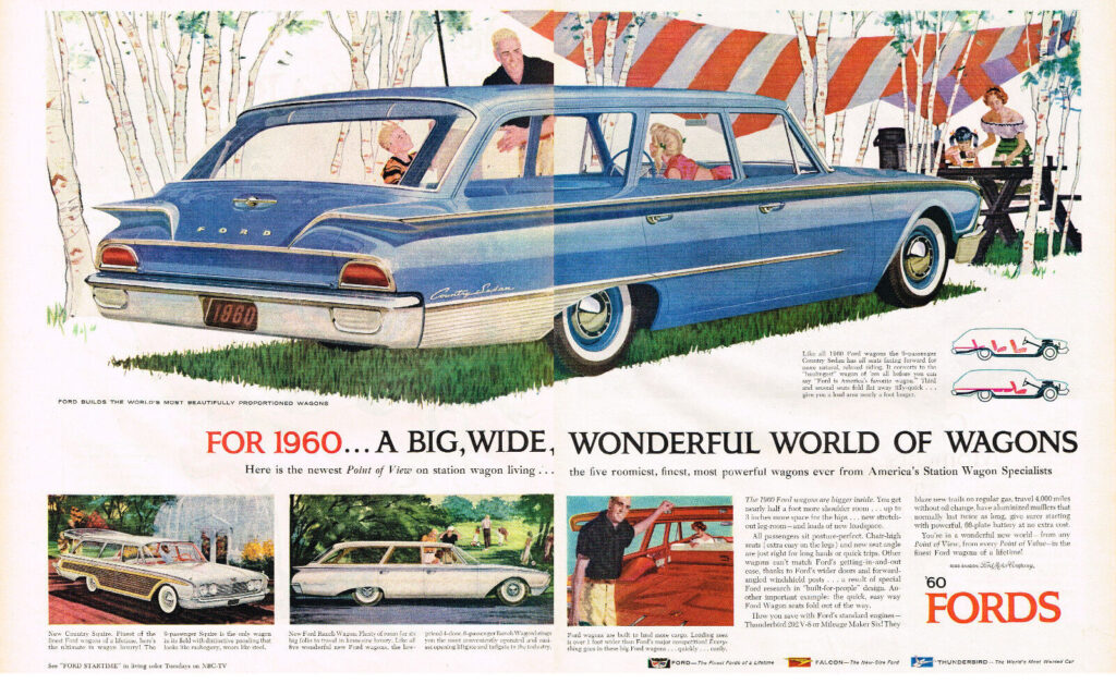
Take a close look at the tiny diagram of the seating configuration on the right. That’s three rows of seats, with the back two able to fold down for plenty of cargo space. A THIRD ROW!! That’s the same feature that makes people go bananas here 60 years later in 2023. And somehow we’re so proud that we just invented it.
Let’s take a look at another ad for a 1960 Ford Country Squire wagon, the white one below. Notice how the 9 passengers in these illustrations are arranged to be perfectly happy–never cramped.
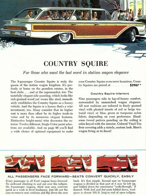
I own a vintage woody wagon from a different era (1995, actually) and I have a family of 8. Not once has my wife and 6 kids piled into my wagon and felt like it was roomy. When I look at the ad above, I am jealous of these magical wagons.
Effective in 1960, Still Effective Today
There are several graphic design principles that are worth pointing out in this last ad (with the white woody wagon.) These principles are as true today in 2023 as they were in 1960.
- Every heading (aka title) needs a subtitle. We see this on every effective marketing website today.
- White space is everything! Notice how much blank white space we have around messaging in two paragraphs in the center of the ad. As designers, there is a temptation to fill every square inch of an ad or website with more information, but the reader/user just gets stressed out. “When everyone is shouting, nobody is heard.”
- People like sequences of three. Here we see three configurations for seating in the wagon. Notice on the homepage here on smithhousedesign.com, I have three columns explaining what we do. I talk more about this in my blog about branding presidential campaigns. This rule of three works exceptionally well in interior design.
- In general, people can’t read paragraph text that’s more than 4 inches wide. This is why newsprint has narrow columns. Here in this ad for the white wagon, we see two columns, each about 2.5 inches wide. Maybe this is why people prefer to read blogs (like this one) holding their phone vertical ?↕, rather than horizontal ↔.
- Text that is fully justified looks lovely because it spreads sentences to have a perfectly crisp left and right border. But it only works if you have a lot of words.
Anyway, props to commercial artists Art Fritz and Van Kauffman for creating a little bit of magic for car buyers in the early 1960s. You dazzled people then, and we’re still dazzled today.
I am leaving you with a gallery of many other beautiful ads from the early 1960s. Look at them closely and look for the patterns and techniques that we covered in this blog. Also, enjoy the movie-like stories in each ad! ◼️
