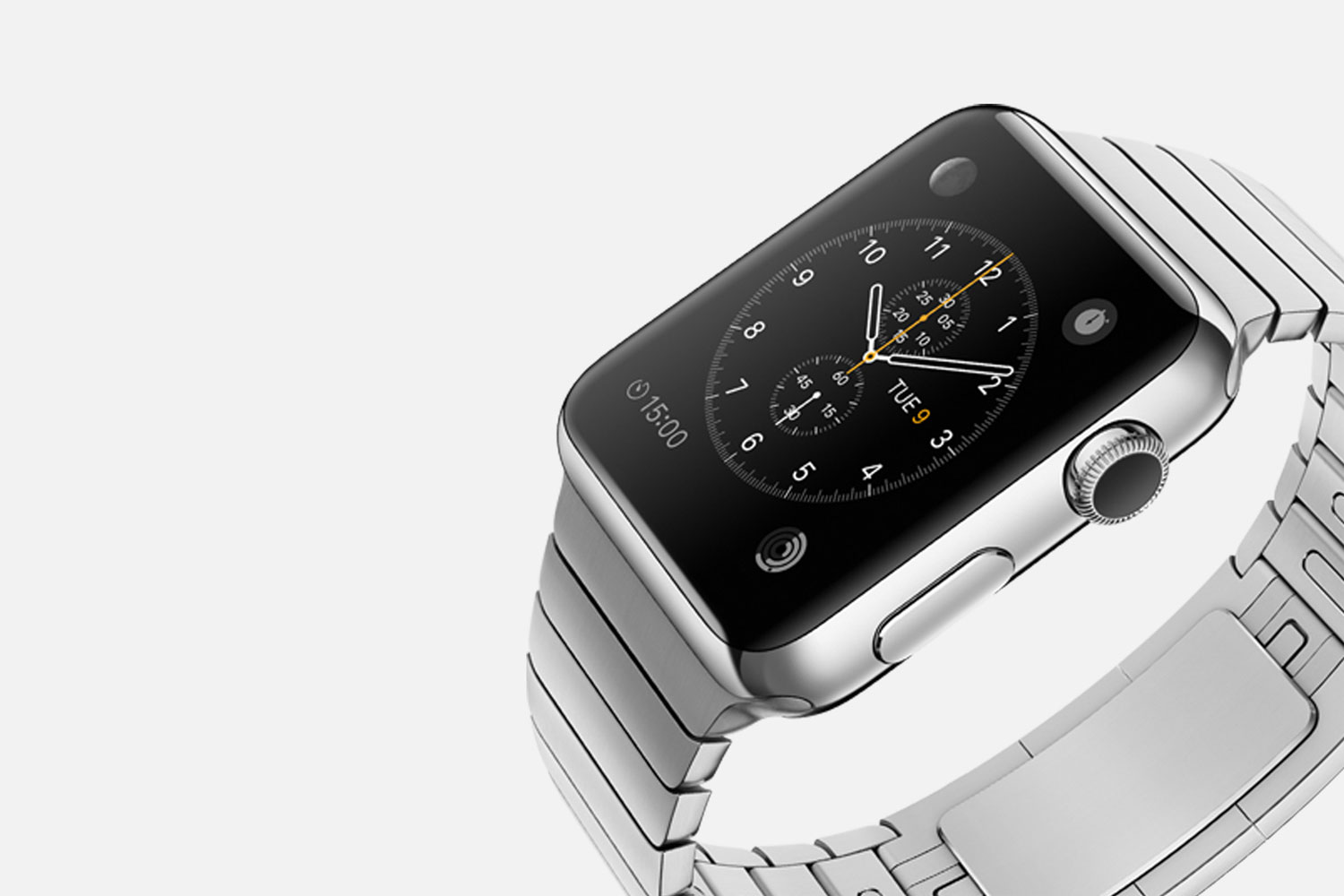
Flat Design became a thing with Microsoft in 2011. It was made cool by Apple with iOS in 2013, and now in 2016, it’s being exposed for its weakness. Proof: Instagram’s new logo.
As is the case whenever there is gushing news, every content manager or publisher rushes in to post something--anything!--to climb higher on the news feeds and trending social news. In the middle of this frenzy, news outlets have published inaccurate information.
Namely, that Apple started the Flat Design Trend with the new iOS released in 2013, when it should properly be credited to Microsoft in late 2011. This is a factual error, but the more interesting stuff is not about parsing over facts.
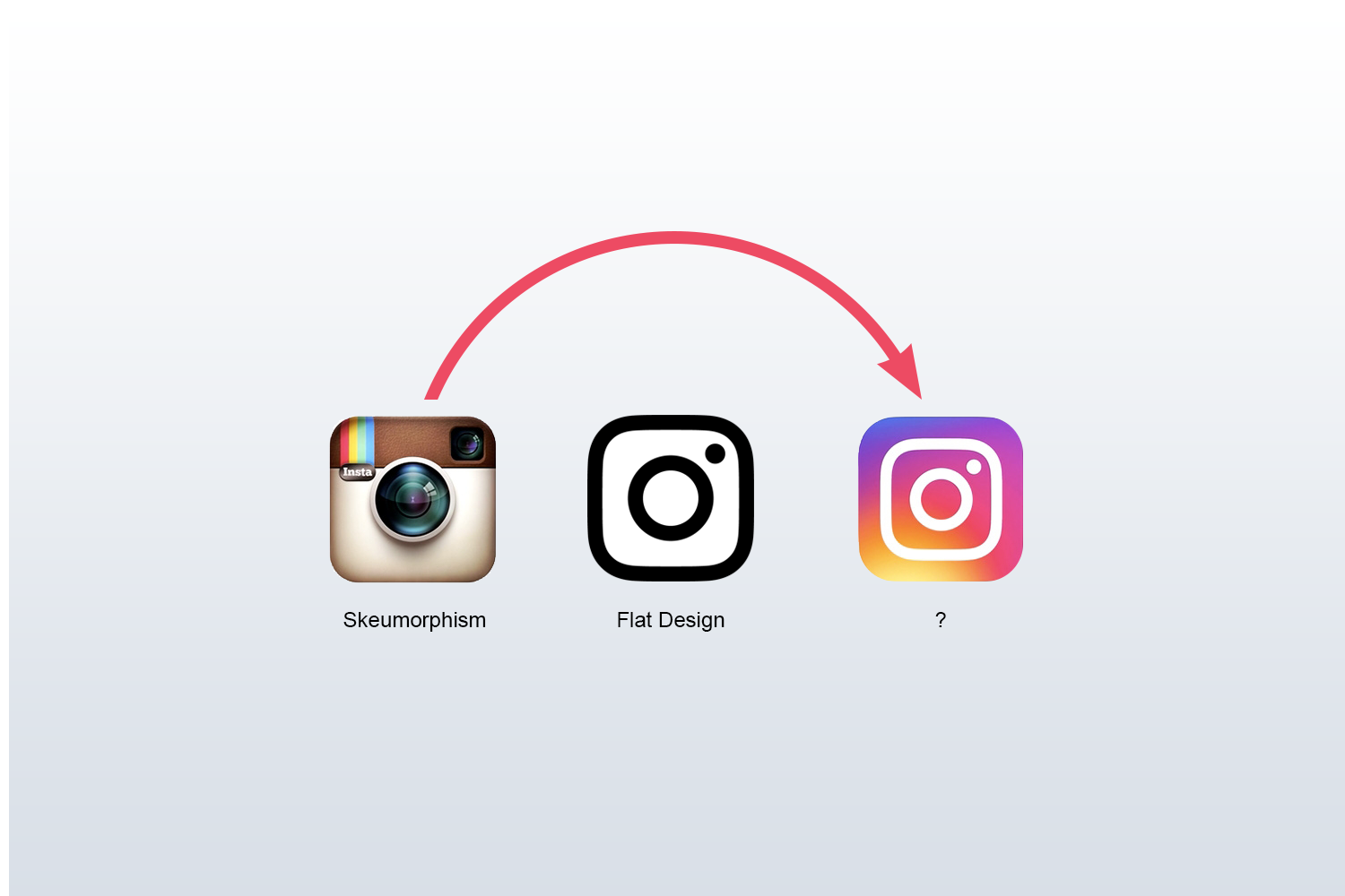
A lot of journalists, bloggers, and social media pundits declared that Instagram was the last holdout of skeuomorphism, the hyper-real and super-detailed style of design that often imitates a real-life product.
I agree with this. If you look at the logo below (Instagram's official logo from a couple of weeks ago), you'll see that it is loaded with detail that mimics a real life camera.
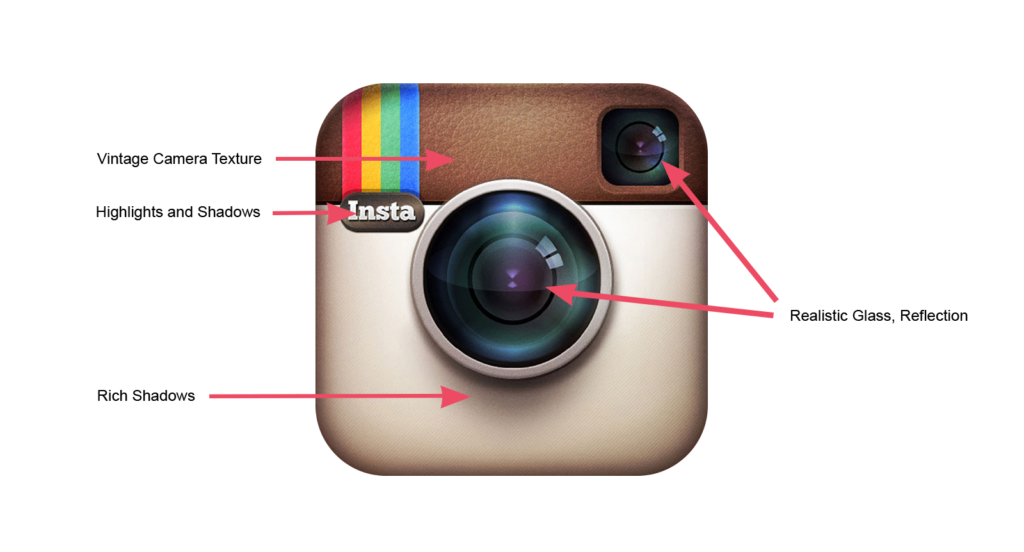
However, many journalists concluded that finally Instagram is embracing the newest cool thing called Flat Design, where everything is simplified to its purest form. Simple lines. Simple colors. Simply typography. I mean, if you aren't into the skeuomorphic thing, you by default must be Flat Design, right?
Nope.
A quick glance at the new logo shows that the design team behind the new Instagram visual system is CLEARLY BREAKING RULES of Flat Design. Specifically, they put a big rainbow burst in the middle of the app icon. So they've leaped past the Flat Design trend and they're doing something new.
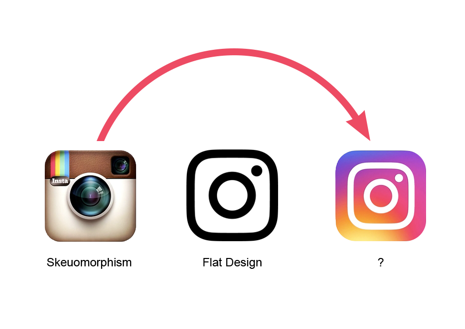
I believe that the design team at Instagram respected the purist ethos of Flat Design, but in real time, it was ripe with weaknesses. We’ll get to that later.
But first, let’s give some credit to Microsoft. Let’s not be too cool to admit the truth.
Microsoft Got There First, And How They Did It
Designers who specialize in User Interface / User Experience (UI/UX) knew that the era of hyper-real skeuomorphism was going to have to come to an end. The trend of creating luscious icons with excessive detail was a lot of fun, and you got paid a lot to do it. But it couldn’t go on forever. Eventually, we’d have to ask forgiveness for that indulgence.
For the last several years, UI/UX designers shared their stripped-down icons and user interfaces in social spaces like Tumblr, Behance, Dribbble, and Twitter. It was a “waving the flag” to signal that skeuomorphism was over, and it was time for something new.
I’m not a Microsoft insider, but I would argue that their designers were in these same places and they saw this trend of “flattening out” icons and graphics to their purest forms. They figured that it was an inevitable shift in design and Microsoft just decided to go for it before Apple--the cool kid at school--told them that it was cool.
Microsoft was already losing the Mobile OS game, and with every day, fewer people were purchasing PCs boxed with Windows.
- So, why not grab onto a leading edge trend now?
- What did they have to lose?
- Eventually Apple would embrace the flat look, so why not beat them to it?
The plan worked. Microsoft released a new Windows operating system that was flat-tat-tat-tat.

For a brief moment, Microsoft had the glory. But nobody admitted it at the time. And within a couple of years, Apple got hip to it and then got even more glory. (Ironically, Apple was never reprimanded for taking lead from Microsoft.)
Apple's Success as a Weak Spot
This is not the first time Apple’s continued success was eventually exposed as a weakness.
Every college kid since at least 2005 already knew that streaming music was an easier, low-hassle way of enjoying your favorite music. Why waste time pirating music or downloading physical MP3s from the iTunes store? It just burdened your hard drive, and it wasn’t even necessary. It was as silly as downloading a TV show when you could just stream it online. Streaming is the way to go, bro.
Yet Apple was selling a lot of iPods paired with iTunes. Apple was making a fortune by letting people buy and download not just music, but shows and movies on iTunes. So why encourage people to stream media before they are ready? We’ll make a few more billion dollars because we can.
So in the world of streaming music, Apple showed up late, and they knew it. Spotify was killing it. Rdio had its fans. And Beats by Dre had grown from being a headphone company with street-cred to a streaming music giant. I would argue that Apple purchased Beats not just to get into the trendy headphone market, but to buy it's way back into the leading edge of streaming music.
And the price was steep: $2,6 billion. That's $2,600,000,000.
What Took Flat Design so Long?
History has proven that great excess eventually is followed by a “market correction” (as economists would describe it) where things have to get real. Home prices cannot go up forever. The stock market cannot rally to new highs every day. Eventually, this thing has to slow down, right? Yes, but not always as soon as you’d think.
Many designers, including myself, predicted that the saturated detail of skeuomorphism would have ended much sooner than it did. But who could have predicted in 2005 (when these predictions began) that the smart phone revolution around the corner would disrupt everything, including our cute theories?
Let's remember: Apple began the super-real looking desktop icons when it introduced OSX back to September of 2000.
Believe it or not, the nifty bottom-bar with those luscious software icons that we see at the bottom of our screens date back a good 16 years. (See the original here). This is where the seeds of skeuomorphism were first planted. September 2000. That was when Justin Timberlake was still in Nsync*. That was before Reality Television was a thing. That was before social networks and YouTube. That was a LONG TIME AGO. That's how long we've been doing this skeuomorphism thing.

OSX evolved through the early 00's and its native applications got richer with skeuomorphic detail. If you looked at your Calendar, Calculator, or your list of friends in Contacts, you'll notice that both looked pretty much like a real calendar and a real contacts book. Maybe even better? More fun?
The trend gained momentum with each year but got a rocket boost in 2007 with the introduction of the iPhone (and later the iPad) and the mobile iOS that powered the devices.
These little glass-faced devices had resolutions much richer than the desktop computers that we used during work hours. We could see more detail in a smaller space. It was part of the magic of the iPhone that we take for granted today.
Apple leveraged these beautiful resolutions with an ever more rich iOS user interface and app icons. Once the App Store opened up and a flood of new creative companies entered the mobile era, they took Apple’s lead and added more momentum to skeuomorphism. This is where Instagram's story began.
It was a big party, and we all loved it. Why would you want Flat Design? This is just too much fun.
This was no time for austerity measures.
The Limitations of Flat Design
So now we've swung the pendulum hard in the direction of simplicity. We've had a few years to design with simplicity and experience simplicity on our devices. If you look at the era of skeuomorphism, you would predict we have a good 10-12 years before Flat Design is over and a new trend takes us in a new direction.
So why has the design team at Instagram ALREADY abandoned the purity of Flat Design? It's because they see three fundamental limitations of simplicity:
I. When everyone is flat, everyone looks the same.
Think about it. How many weather apps can you have before they all start looking like little line drawings of sunshine and a cloud? How many fitness apps can you design that doesn't look like a drawing of a heart, a running shoe, or a little dumbbell? When you consider that there are millions of applications in the App Store, it’s the next logical conclusion that we’re going to have to do more than draw cute glyphs and call it a day.

II. There is only so much room to be creative.
If all you have to design with are simple shapes, and lines, you eventually run are artificially stunting the impact of your brand. Look at Instagram's logo without the rainbow. What is it? It's a rounded square within a rounded square with two circles.
That’s four shapes. Four! That’s all you have to define your entire company. And know that everyone else is using the same shapes. How can you differentiate your photography app from everyone else?
You can't.
III. Color is delicious.
Black is great and white is great. Yay! But without a little brightness from the colors of the rainbow, we get bored pretty quickly. At most, I’ve seen flat design embrace 2 colors in addition to black and white. Any more than that and you would go too far out of the Flat Design ethos and lose your cool points. But who are we trying to please? Humans love color. Our world is filled with color and we love it!
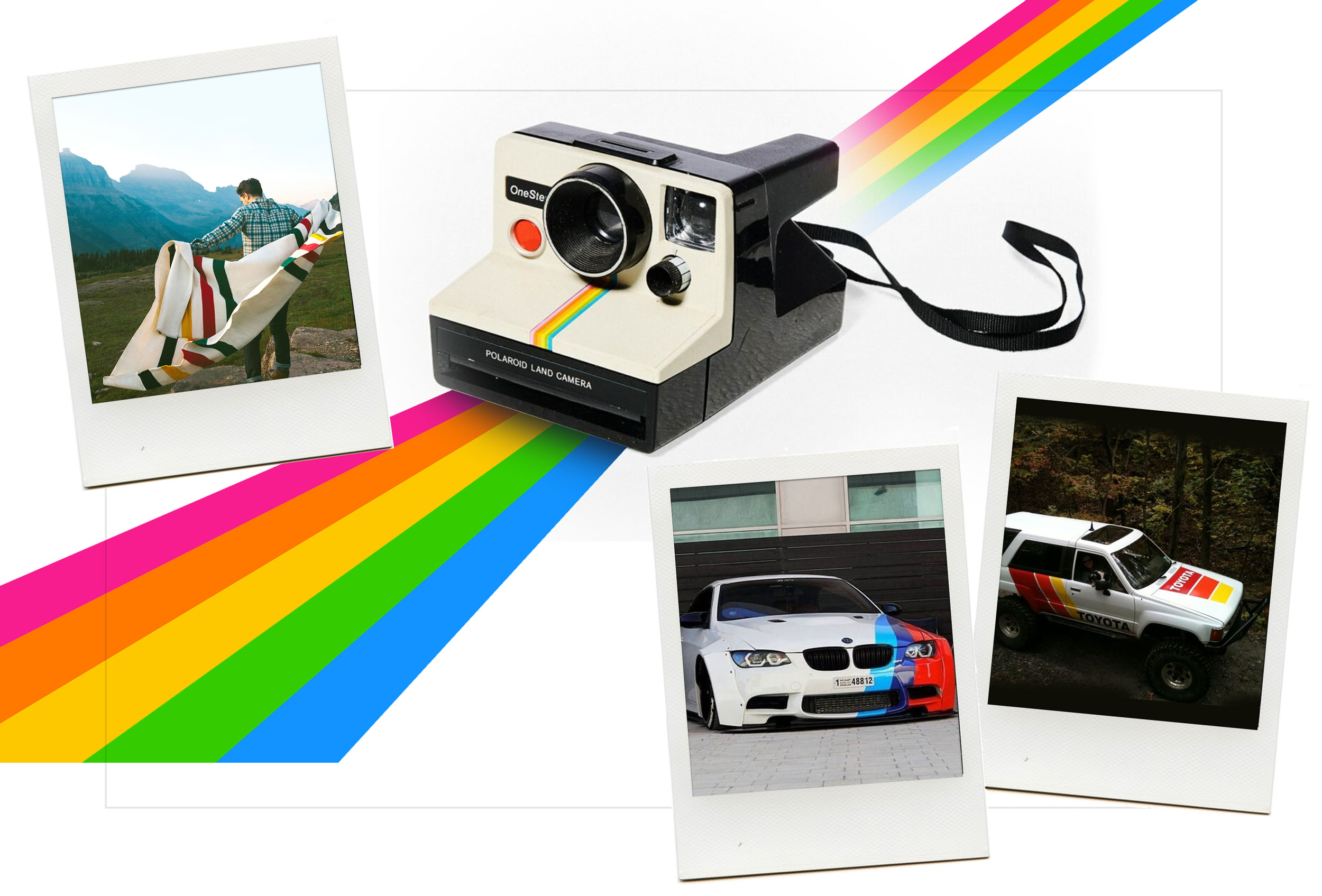
Of course, Instagram wanted to keep their rainbow from the first logo. The rainbow is a visual trademark that is central to their brand. Just express it in a new and fun way. There is a valuable lesson for anyone venturing to rebrand their company. Yes, be informed by the ethos of Flat Design, but don't be so quick to simplify your branding system that you become just like everyone else.
The Need for Flat Design: UI/UX
For all of its vulnerability when it comes to branding a company, Flat Design may continue to gain momentum in user interfaces. Whether it's a desktop application or a mobile app, there is something sophisticated and comforting about simple, intuitive interfaces.
And for when the simplicity starts to feel dull, the user experience designers delight us with clever on-screen motion. There is tremendous opportunity here and I can't wait to see what talented people come up with in the coming months and years.
Bottom Line: “I’ll have coffee with a splash of cream.”
In a lot of ways, the Flat Design purist movement is analogous to our fundamental issue with Starbucks. If you are not bothered that they are a corporate giant, you are certainly bothered by the 40 oz iced frappuccino-thing in your hand.
We all know that a frappuccino is really just a milkshake with a couple of shots of espresso. It's a dessert that we are pretending is coffee.
Coffee purists snapped and decided to swing the pendulum away from all the excess of Starbucks and towards simplicity. The Third Wave Coffee was born, and people now at cool alternatives to Starbucks. (Blue Bottle, Intelligentsia, Stumptown, Et al.)
Third Wave coffee is about light roasted single-origin coffee brewed just right. Served black. It's a purist thing.
If you went to one of the coffee shops in their early days, you would be afraid to ask for the half-and-half. Because if you did, your barista would give you a death stare and then insist that you leave the building. You would comply, and you would hang your head in shame.
Now, a few years into this Third Wave, people aren't as rigid as they used to be. It's okay to ask for a splash of cream in your single-origin Ethiopian coffee. You can appreciate that the cream enhances the palate to accept the rich fruity flavor of the coffee bean.
And we're thankful for the Third Wave of coffee for standing in principle and helping us taste something that we were missing all those years: simplicity.
So thank you Flat Design purists for pushing us out of the excess of skeuomorphism. Now let's enjoy where this new era of design takes us.
