iTunes and the iPod released the musicians. iPhone released a new generation of software developers and game makers. The iWatch should release the designers: graphic designers, industrial designers, experience designers.
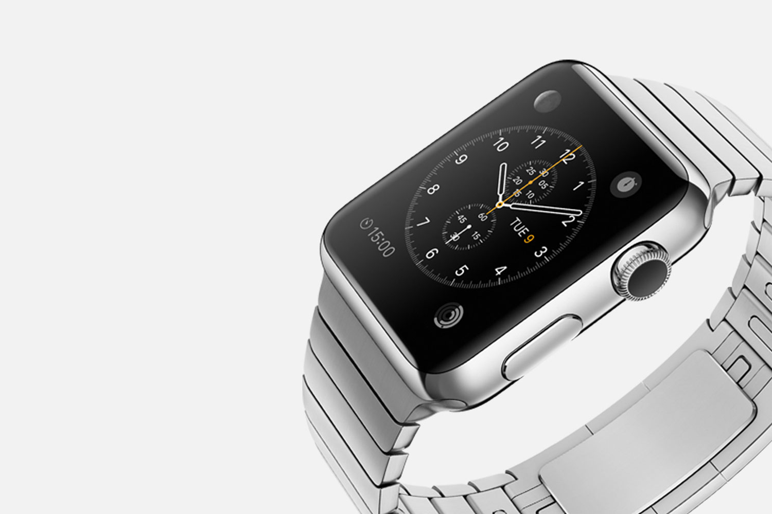
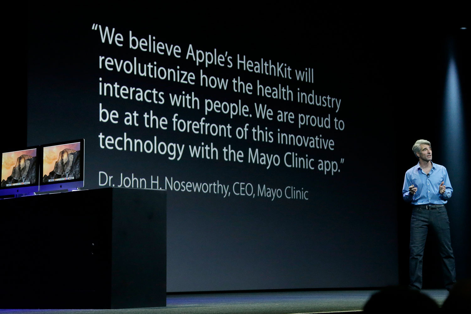
In previous blog, I wrote that fundamentally, the iWatch has to solve the social problems that the iPhone has created. In a second blog, I shared my theory that Apple's new Health platform isn't only about fitness, but foray into healthcare that would be possible only with a new device--the iWatch. Today, I want to put all that aside and talk about making the iWatch look cool. Why? Because I love vintage watches and, quite frankly, I won't swap out a Tudor for an iWatch no matter how zippy it is.
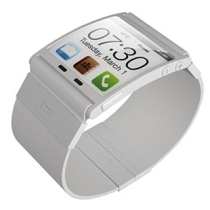
There's been a steady increase of buzz in the mainstream media about the iWatch over the last couple of months. It's no longer a novel obsession with techy-gadget-type-dudes, but a legit topic those shows up on the business pages of the Wall Street Journal and the New York Times. The real blind spot in all of this buzz is the paradox of "wearable devices" or "wearable technology." We're all acting like fashion and technology can co-exist. Fashion is so subjective, and technology is not.The ugly collision of fashion and tech is the singular reason why "wearable devices" since the dawn of the digital age have flopped. People will not sacrifice fashion for technology, no matter how cool the technology. I mean, really, have you ever seen anyone wear a Google Glass?So we are at an impasse. For Apple's iWatch to succeed, fashion has to be as high of a priority as the tech on the screen. And the established pattern of cute accessories to "customize" your device won't be enough. That's for kids with a Samsung watches.Apple needs to release designers to create unique, cool watch faces with even cooler functionality. Millions will buy the same iWatch, and then upgrade it to have the look and feel that's right for each individual. Surfers could have info-graphs on high and low tides and which beaches have the best waves. Hikers should know their altitude and see weather patterns. These are fun capsules of information that can also look cool when it's built into the "home screen" of your iWatch. The possibilities for unique and interesting watches are limitless!
Apple: This is How You Make it Happen
Apple always releases an Software Development Kit (SDK) to Developers so that their mobile devices get more valuable with time because the apps get more useful. Apple rewards those app makers by giving them a marketplace, the App Store, which gives them access to an ocean of customers and money. If Apple can create a similar platform for designers, Apple magically solves the problem of making technology fashionable. Everyone wins.As a designer, these are some tools that I need:
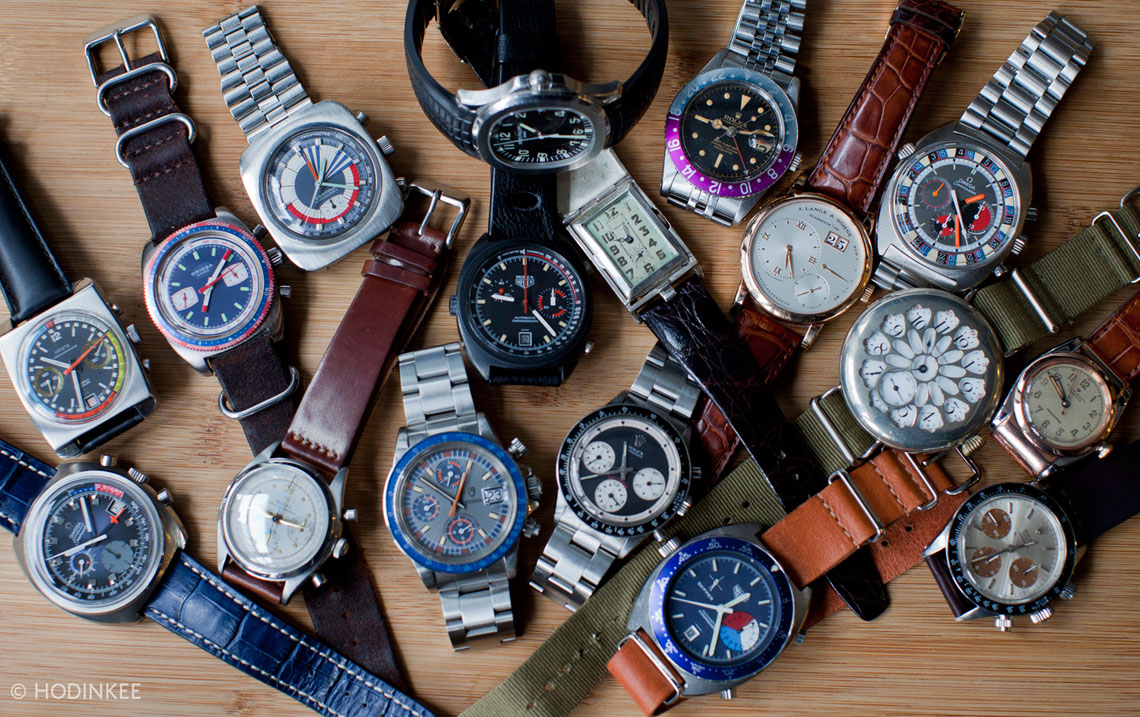
- 3D Rendering - There are endless options for designing a watch when you have three dimensions to work with. If you study the best vintage watches from the 1960s and 1970s, it blows your mind how much detail can fit into that little space. (See the image of Alan Maleh watch collection above.)
- Illustration / Design - Graphic designers should feel that they have all the power of creativity that is built into their favorite software: Adobe Photoshop and Illustrator.
- Motion Response Design - Part of the fun of a nice vintage watch is its interplay with the sun. It's more than the bling. It's the dramatic reflections, shading, and "drop shadows" behind the hour, minute, and second hand. I don't want to lose any of this, and I shouldn't have to. My iPad and iPhone both know what time of day it is, which direction I'm standing, and whether it's cloudy or sunny. That's all the information they need to have a realistic rendering of shadow and light.
- Developer Tools - An iWatch design can't be just about aesthetic. I would be disappointed if my only options were "skins" for my iWatch. I want function! Let me have some cool like a vintage watch stuff like chronograph, day/date, and military time on the bezel. And of course these developer tools would need to do the more sophisticated apps too.
What Do I Want?
I am a fan of vintage watches. I love those ingenious automatic, self-winding watches that somehow kept perfect time without batteries or quartz (or WiFi). My favorite are the sportsman watches from the 1960s and 1970s: diving watches, pilot watches, military issue watches, etc. For fun, I read about watches, I watch videos with people talking about watches, and I explore watches on eBay. When I travel, I seek out vintage watch stores. A perfect day for me would be to hang out with Ben Clymer and John Mayer and talk about watches. These vintage watches inspire the work that I do with smithHOUSE. When I work with clients who love vintage watches too, we're able to use them as a metaphor for their mobile and web designs. It's a fantastic swirl of interests--vintage aesthetic, timeless principles, and modern design. Why can't we bring some of the vintage magic into a new wave of innovation? Modern tech has something to learn from the vintage tech from Rolex, Heuer, Tudor, and Omega. There's no need to re-create the mechanical components in the iWatch, but there's something electrifying about the overall design of these vintage watches. When I look at mockups from Apple fans of iWatches, none of them are electrifying. It just looks like a watch with a few icons from an iPhone. So I guess then what I am saying is this: Apple, give us more than a nifty smart watch. Give us something to get excited about, something beautiful and timeless. Release the designers.
