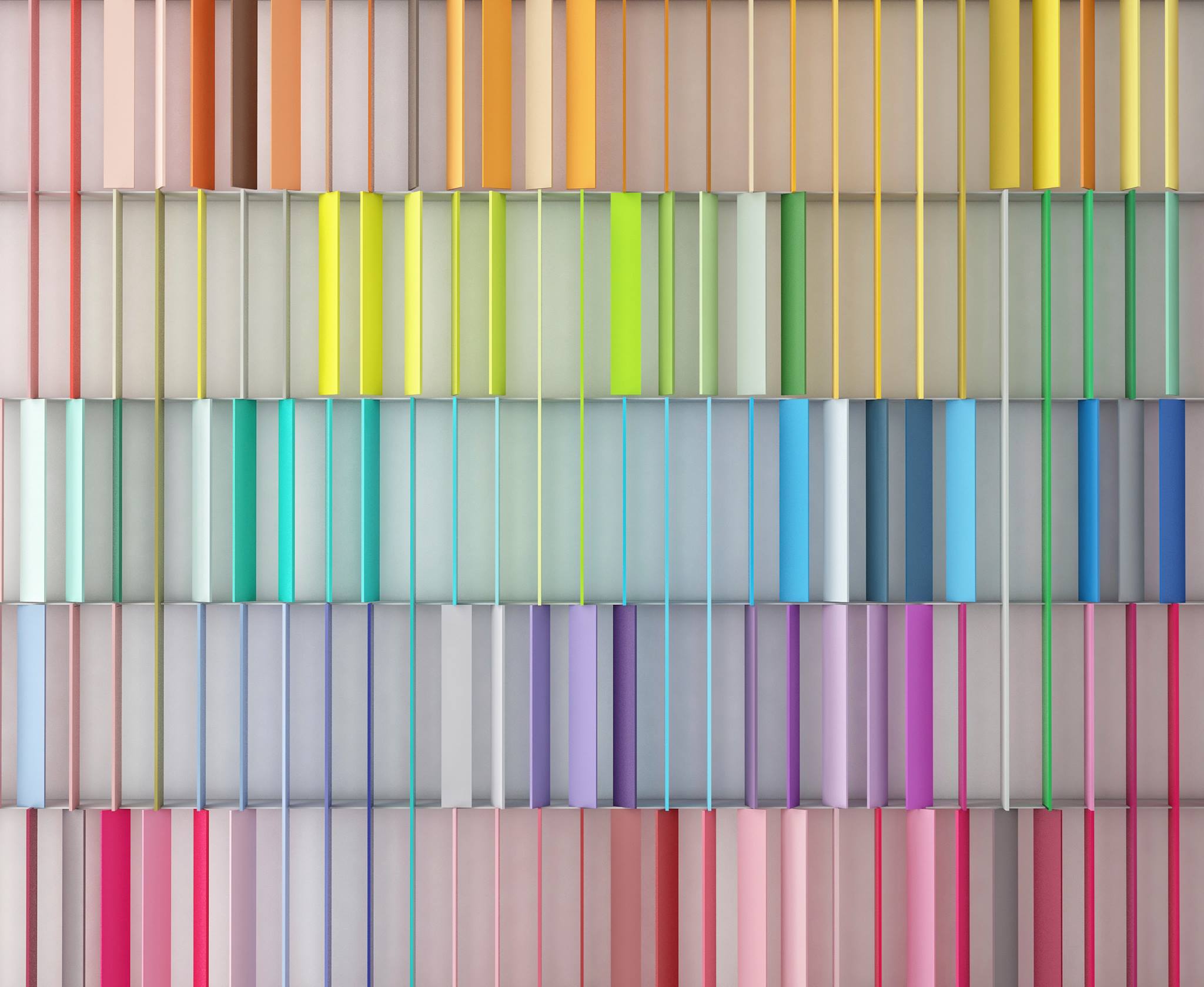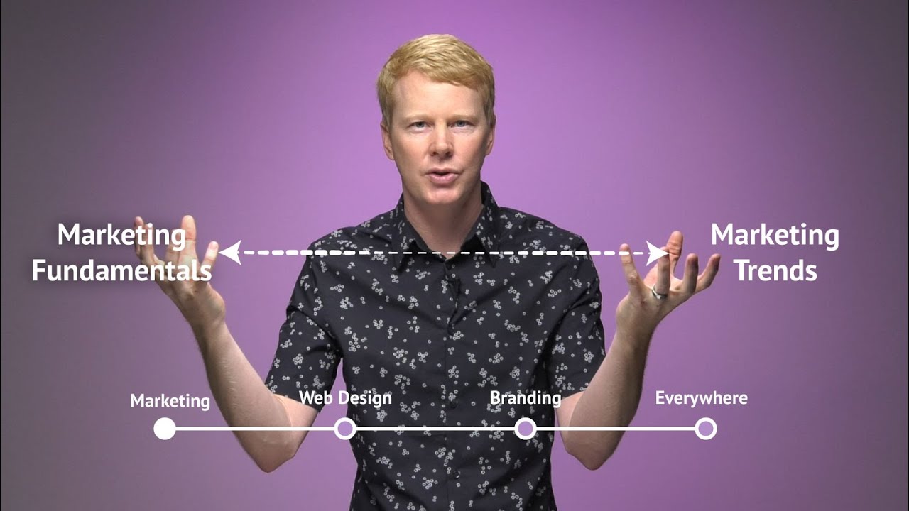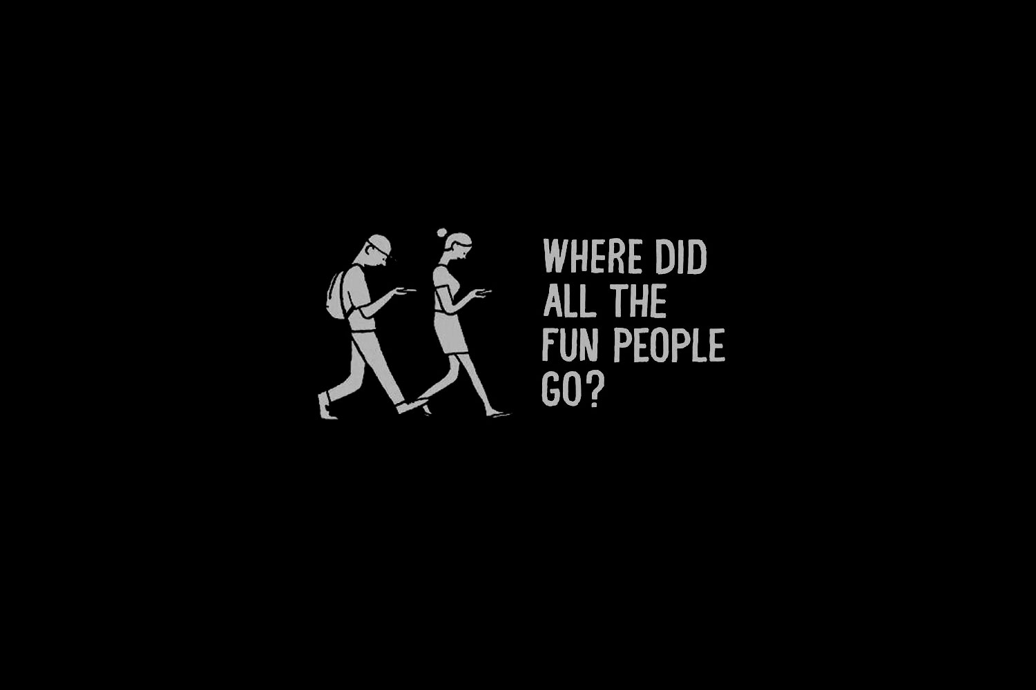
It was easy to point to color trends in previous decades of American culture: turquoise in the 1950s. Earth tones in the 1970s. Neons at the end of the 80s and early 1990s. Lime green in the late 1990s. And within the 2010s, we've seen all kinds of blue / teals become cool after only taking 15 years off. Ask anyone about popular colors in their childhood, and they'll have stories to tell. This gives us a hindsight bias and we imagine that there is always a hot color for every new year.
So why is it we go years without a new hot color? How do we make sense of there being a sequence of distinct color trends in the final decades of the 1900s, yet so few hot colors in the first 20 years of the 2000s? Color trends are not constant; a new color trend does not arrive every year on schedule.
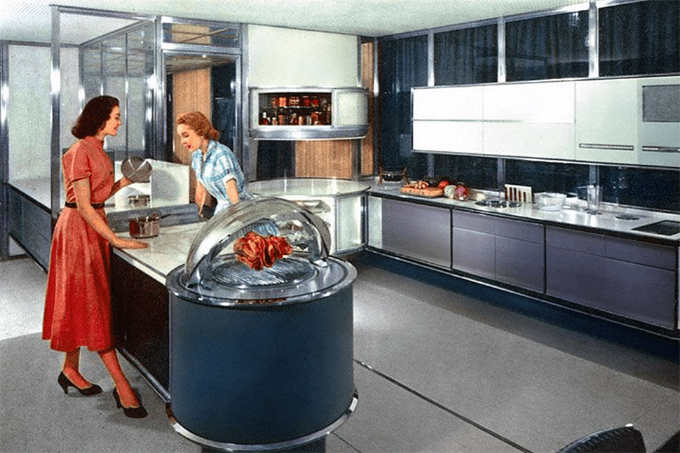
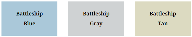
There are brainy people who don't like my opinion because it undermines their very career. For example, The Color Marketing Group has, since the 1960s, made grand predictions every year about what new colors will drop and why. Their formula goes like this: pick a color, come up with a compelling story about humanity, culture, and change. Then repeat until you have a dozen colors. Sell those 12 colors as predictions to consumer product companies, and then hope that those same companies fulfill your prophecy. Maybe this is how we got all those Harvest Gold kitchen appliances in the 1970s.
Nobody gets fired for being wrong about a color trend. Would you put up with this with a stock analyst?
A great surprise here is that nobody tracks winners and losers. Some colors take off, others don't. Nobody gets fired for being wrong about a color trend. Would you put up with this with a stock analyst? A financial advisor?
Me? I don't believe that color trends are constant and I certainly don't believe they are predictable. Maybe pre-Internet when entertainment, consumer products, and culture were determined by a narrow group of people, but not today. Today, color just kinda happens. Everyone is involved. Nobody gets credit.
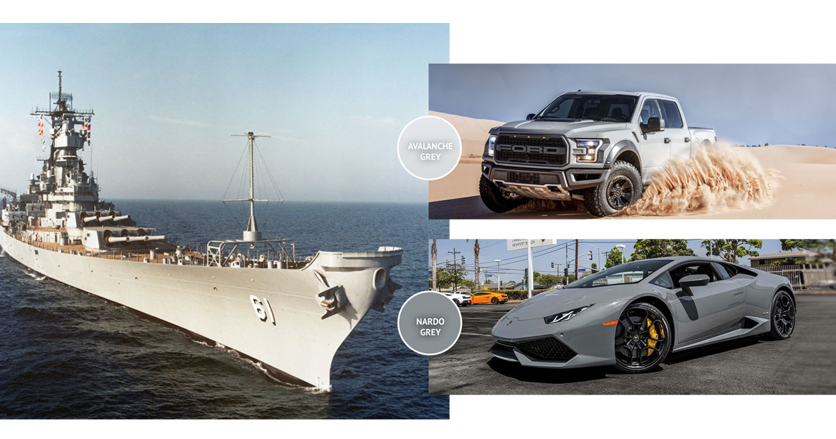
Now let's talk about battleship colors.
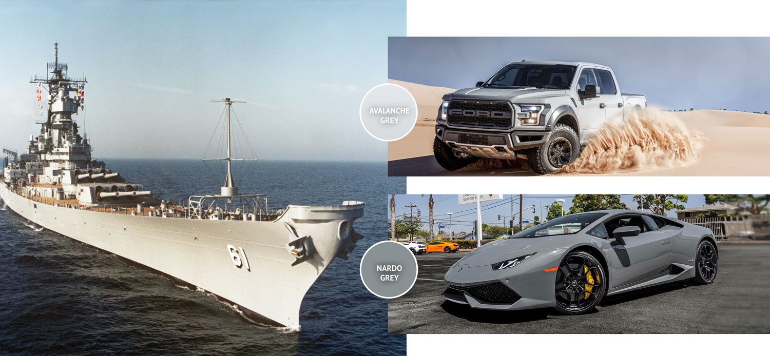
What are "Battleship" colors?
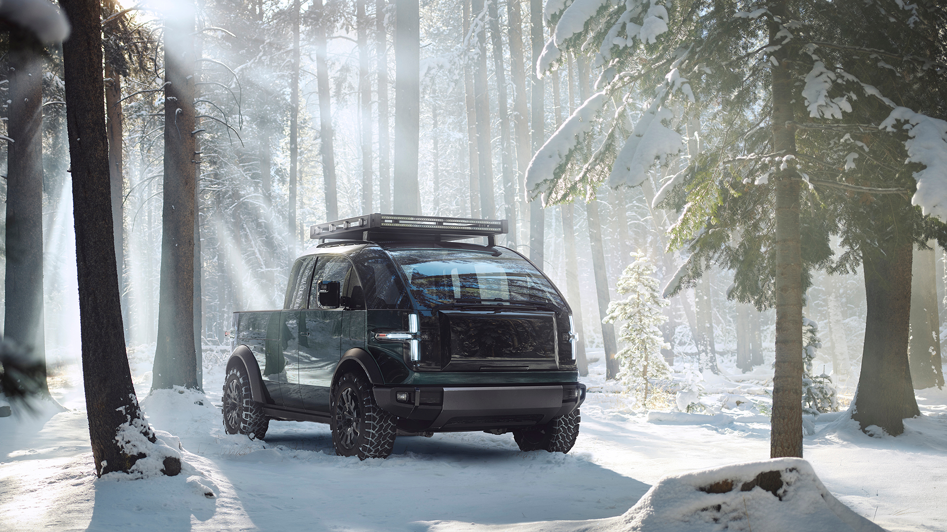
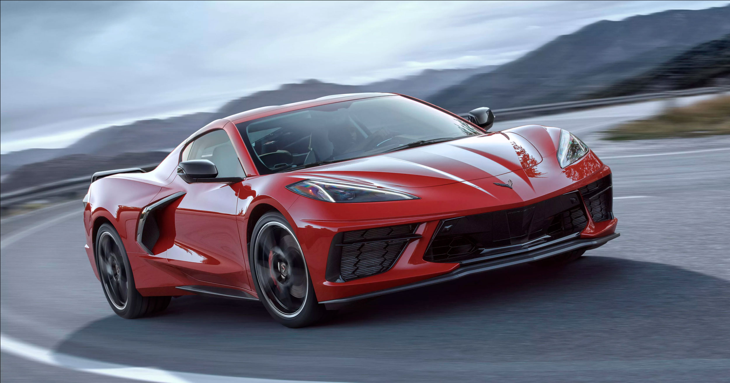
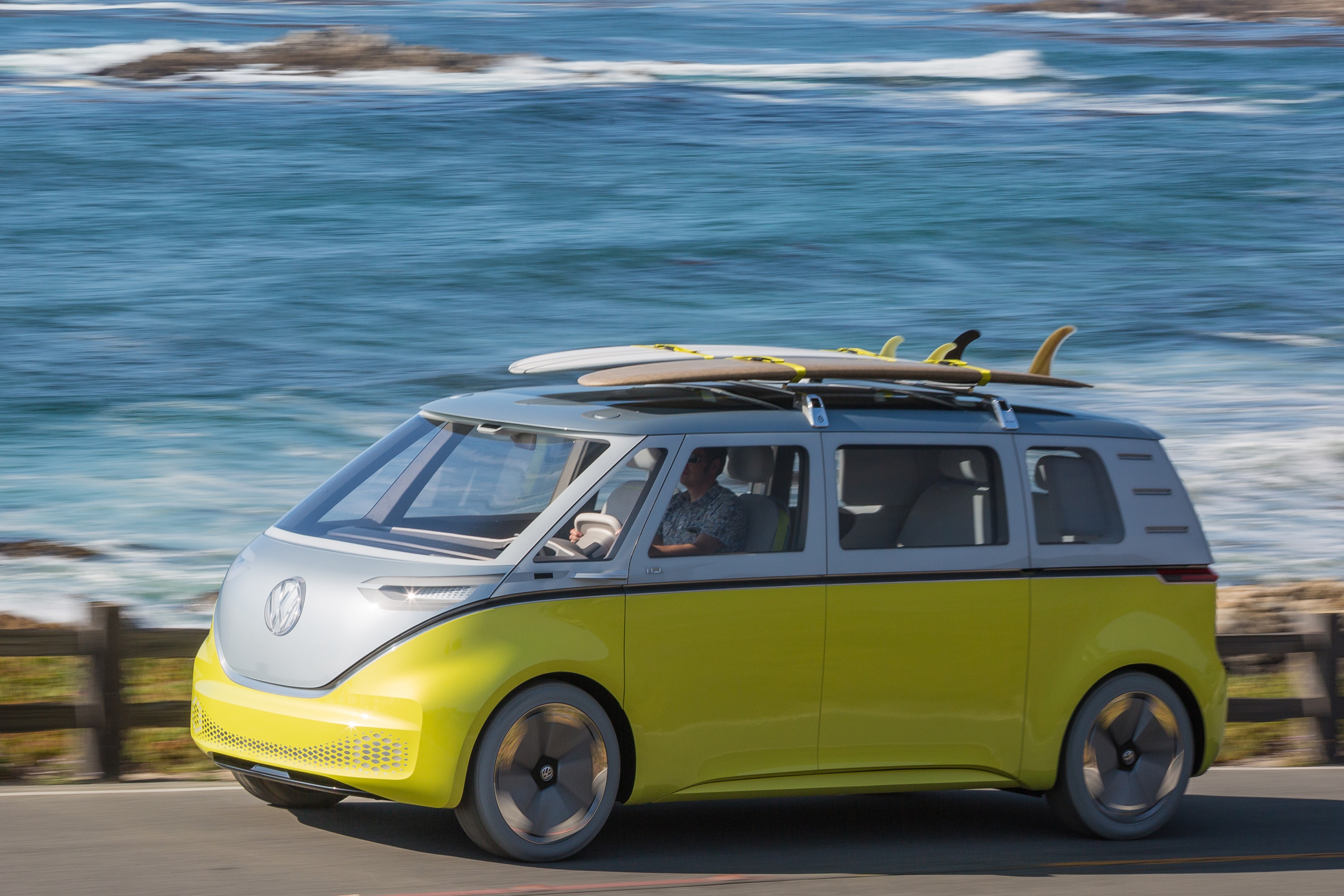
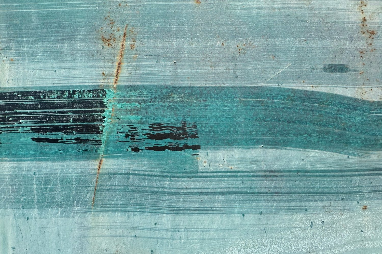
These are the super-dull colors that you’ve seen on cars and trucks in the last couple of years. These are "impossibly dull" versions of blue, gray, and tan.
Why call it Battleship?
Nobody else is calling it this. But if you look at US battleships, they are the most dull colors imaginable. So I decided to label these new tones battleship.
When did this start and why?
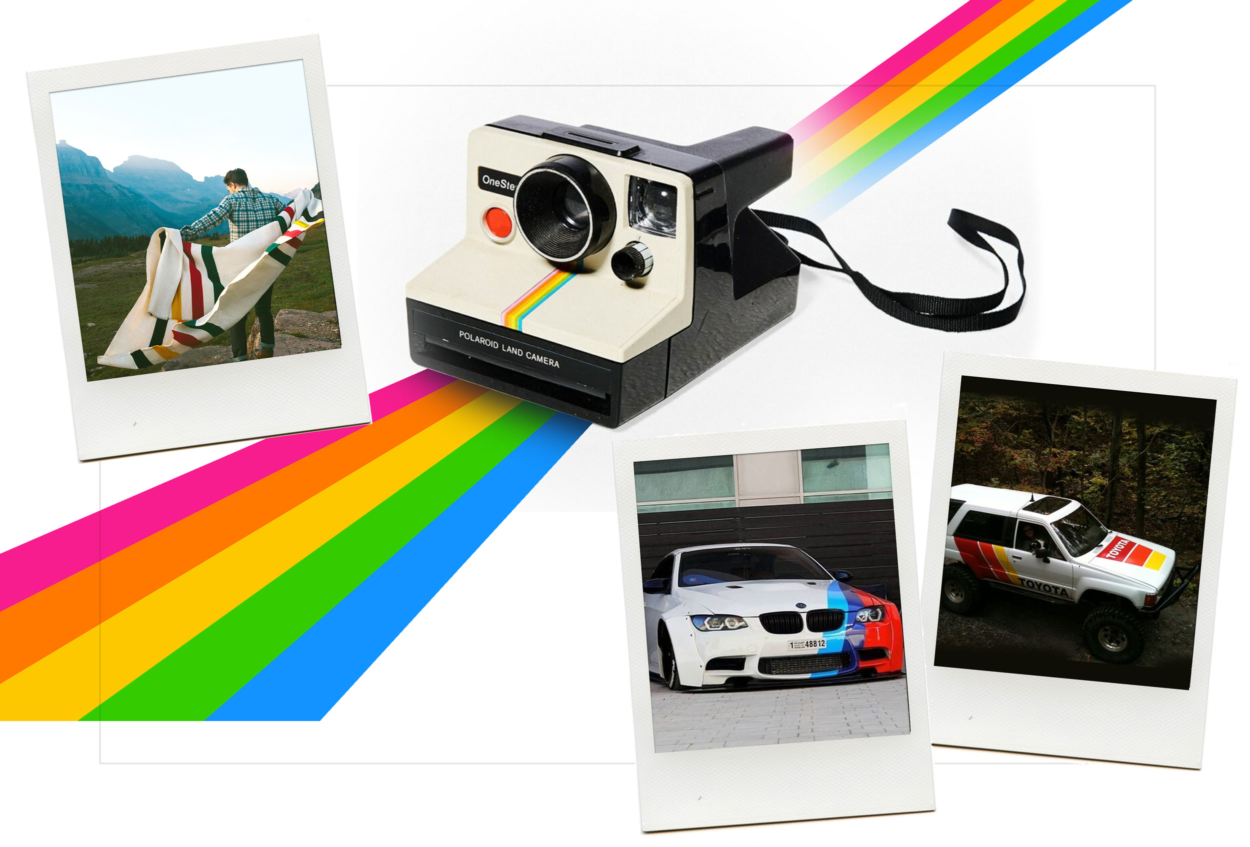
Matte or flat paint has always been cool to brave car enthusiasts who fixed up older hot rods. In recent years, auto companies dared use matte paint on new cars, and they didn't sell well. (Example: 2011 BMW M3)
Undaunted, carmakers kept mixing colors to find something shockingly boring--no sparkle! None! Then they polished up with Clearcoat. So the car is shiny, but not sparkly. A subtle change, but the results are in. These battleship colors are selling really, really well.
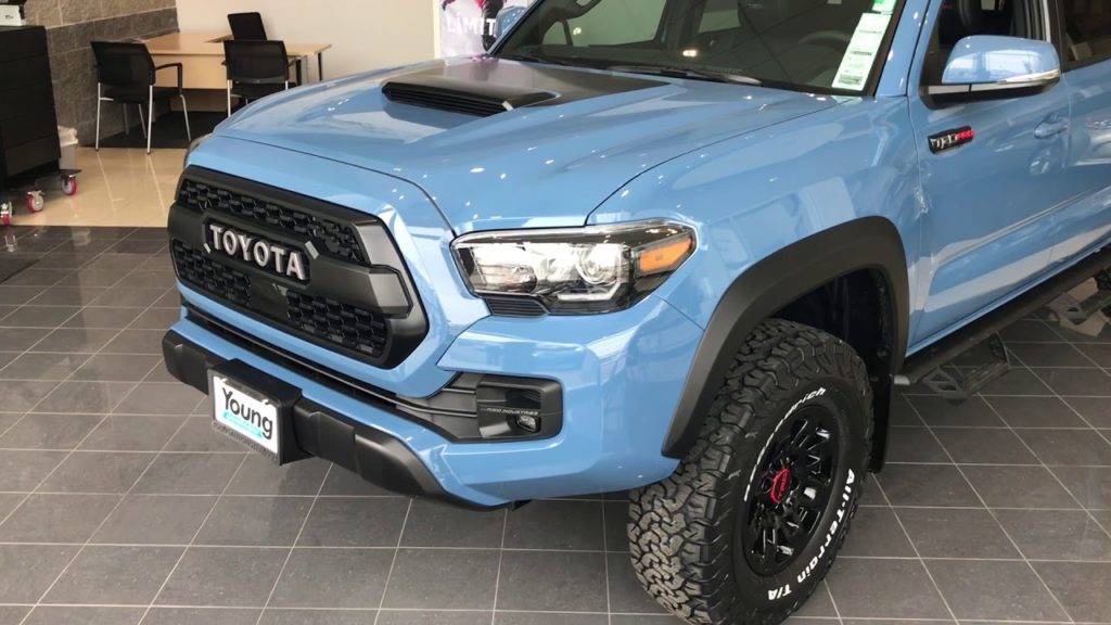
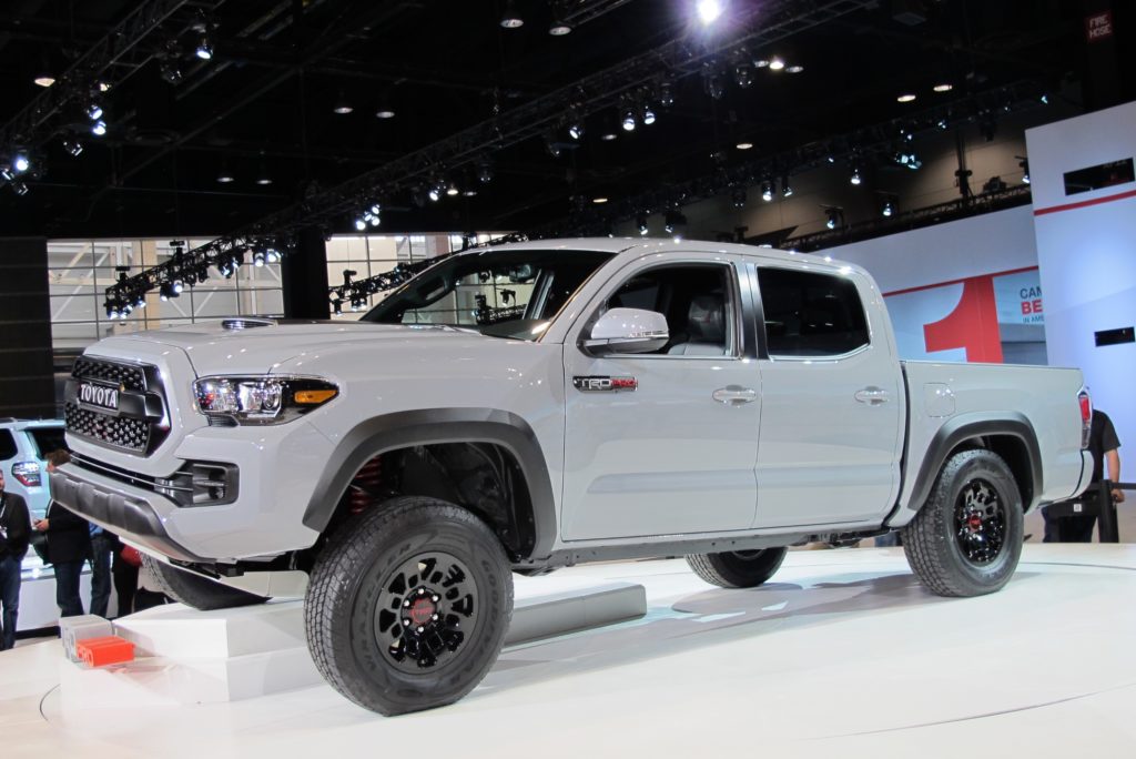
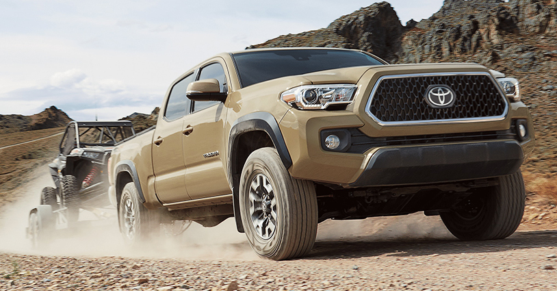
I suppose that after so many decades of automotive design, these counter-cultural colors seem fresh and new. Take a look at Cavalry Blue, Cement, and Sandstorm on the popular Toyota Tacoma pickup truck.
Is Battleship here to stay?
Sure, why not? Young guys in lifted Toyota Tacomas and Jeeps love the tough look. But don't expect to see battleship colors in many other places other than automobiles. These super-dull colors are the default choices for common, unexciting products like plastic storage containers, generic PCs, and those big office printers.
It's only cool when it is a surprise.
It's so dull it kinda hurts your brain to look at it.
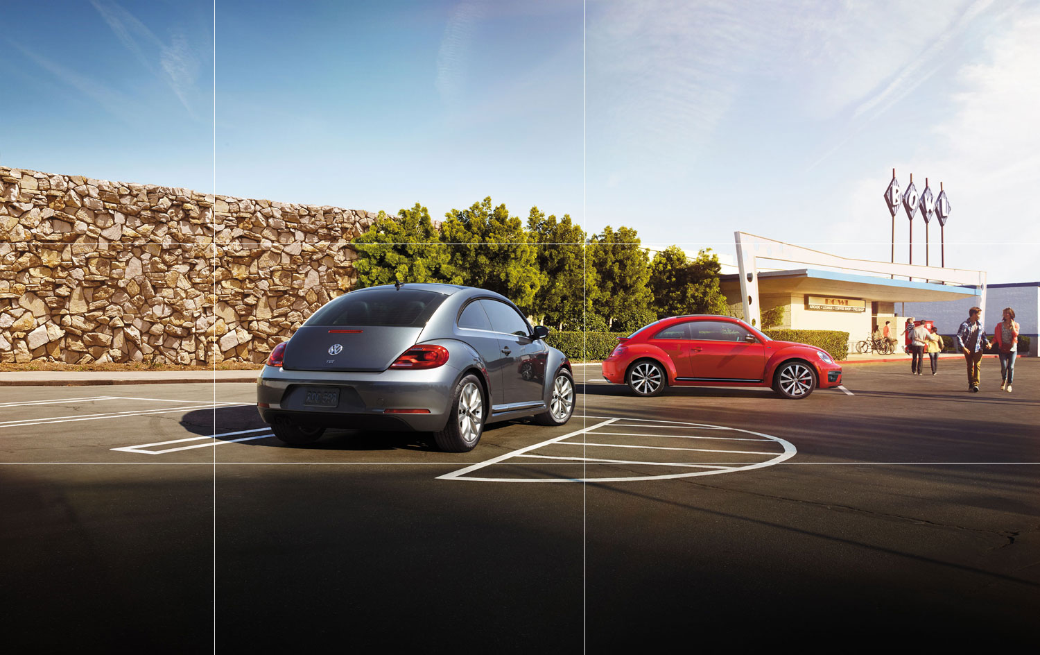
Are battleship colors only on tough-guy cars?
No, it's everywhere. See if you can spot the battleship color options on the Subaru Crosstrek. Or the VW Beetle. Or the ultra mild Jeep Compass.
My Battleship Story
In 1999, I was a student in Industrial Design at Georgia Tech. For a class project, I designed a tabletop fan for hot dorm rooms. I decided to use the two most bland colors available at Home Depot, matte beige and satin gray.
At the time, product design was defined by the candy-colors from the iMac (G3), which, much like the 1990s VW New Beetle, was respected at the time, but has since grown to be dismissed as “too much.” But it was a fun time in product design--every student project in our class shined bright with these playful colors.
I went in the other direction and did something outrageous: I chose bland colors. My classmates were confused, and my professor was reasonably supportive. And honestly, my cool little fan didn't look as good as I thought it would. If someone mass-produced this fan, nobody would've bought it. But I regret nothing.
For every year since, I've looked for any chance that my wacko idea in college has caught on. It seems like finally (20 years later), it has caught on, but who knows for how long. While it lasts, I'm enjoying the dull scenery on the streets. ◾️