April, 2016 - A Note from the Author
I wrote this blog in September of 2015. It took a lot of time to research, look at the numbers, and create infographics. I went on to discuss my theories a couple of weeks later on the Bad Business Podcast in October of 2015 (Listen here.) I never published the blog because it was too much work to analyze with the dozens of characters wanting to be president. Plus I wanted the blog to be relevant, and candidates came and went over the course of writing the blog.
Plus there was something else that bothered me.
When you look at the four things that Obama had going for him in 2008 and 2012, and used those four as criteria for picking the next president in 2016, I came up with mixed results. Two were familiar names, Jeb Bush and Hillary Clinton. No surprises here.
But the other two candidates were way off the grid. One was a socialist senator from Vermont, Bernie Sanders. The other was a hot head New York billionaire and TV personality: Donald Trump.
I was embarrassed and chose not to publish the blog.
Who knew?

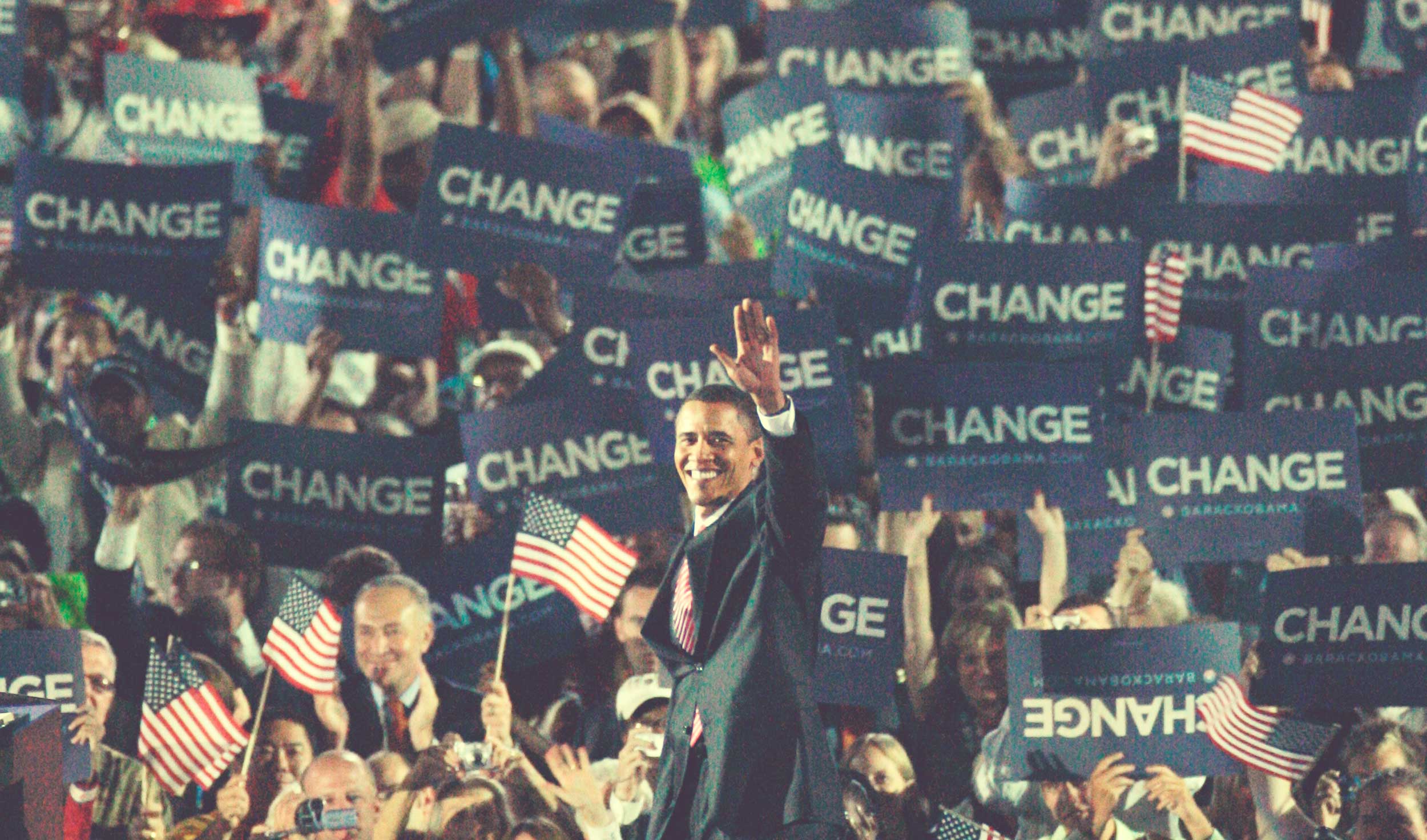
Do we vote on principle? Or is there visual science that persuades our votes? A close look at Obama's two presidential campaigns reveal his statistical advantage over his opponents. Here are 4 facts that are hard to ignore.
Fact 1: Obama had the Perfect Blue at the Perfect Moment
Most politicians go for Navy Blue because it is iconic, strong, and timeless. Going the other direction, Barack Obama and campaign designer Sol Sender took advantage of a happier, brighter blue.
Let's call it Tech Blue. It's in the spectrum of blues that trendy tech startups adore because it looks LOVELY on a glowing screen. Especially when you overlay it with white letters.
Barack Obama had the overwhelming vote of young people who spread his message over Facebook and Twitter. He also set new records for online fundraising. Look at the colors below.
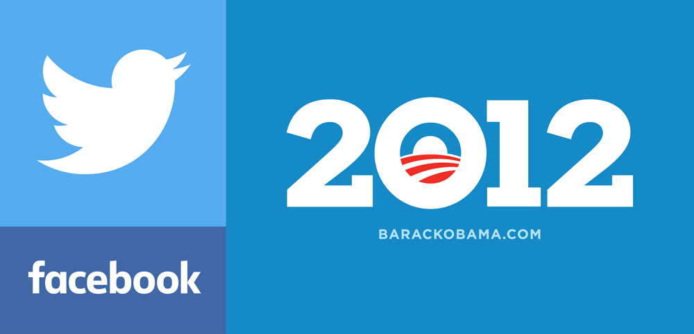
Designer Sol Sender didn't completely dump the Navy Blue, but he recognized that a campaign needs variety. (More on this later)
Fact 2: "O" is the Perfect Letter
Humans are drawn to circles. We find them quite lovely. That is why many, many logos are defined by circles. Two of the most iconic logos from our generation (Target and Starbucks) were built on circles. A quick rule of thumb for new designers: when in doubt, start with a circle. Why do we like circles and thus the letter "O"? Because they are perfectly symmetrical.
2A. The "O" is perfectly symmetrical.
There are only 2 letters in the alphabet that are symmetrical across both the horizontal and vertical axis. The letter "O" and the letter "I".
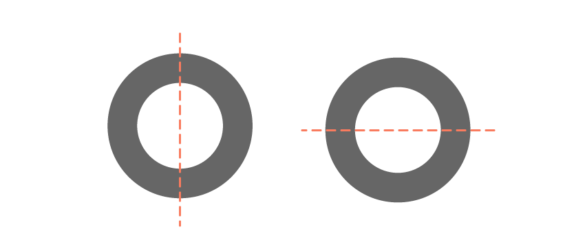
Given that humans love symmetry, the most valuable letter to represent your campaign is either an "O" or an "I". But as we will see, the O is the more versatile of the two. It's more substantial and makes a strong impression. But it's also more versatile...
2B. Because the "O" is a Zero too. Get it?
Because we're human, we like clever things like swapping letters for numbers. It makes us happy.
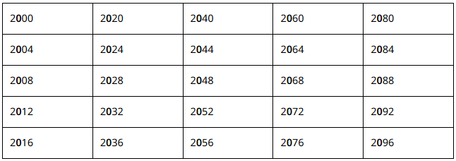
If you are a presidential candidate that can be represented by a single letter, then you better believe the letter "O" the jackpot. Why? Because for the rest of this century, you can swap the Zero for an "O" and look cool doing it. In the 25 presidential elections this century, you could be cool in every one of them. (See table below)
*drop the mic*
2C. The "O" is a perfect canvas or frame.
PERFECT!!! The "O" is the 1 letter out of 26 that has a blank canvas at its center. Special interest groups were able to use the "O" as a frame of the visual icons that matter to them. They got to show how their cause fit right in the middle of Obama campaign. Do a quick Google search and you'll see what I'm talking about.
Fact 3: Because O-B-A-M-A is the perfect number of characters--five.
Here's the deal. Visually, humans like sequences of 3, 5, and 7. This doesn't mean that we like odd numbers in some esoteric or way, but visually, it gives us something to look at in the absolute center. Five is the perfect number, I contend because seven is too long and three is too short. This isn't an exact science, but I stand by it.
Why do we like sequences of odd numbers? Look at the diagrams below.

And, for the win, Obama's running mate Biden had a 5-letter name as well:
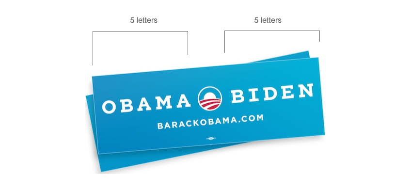
*drop the mic*
Fact 4: Visual Puns
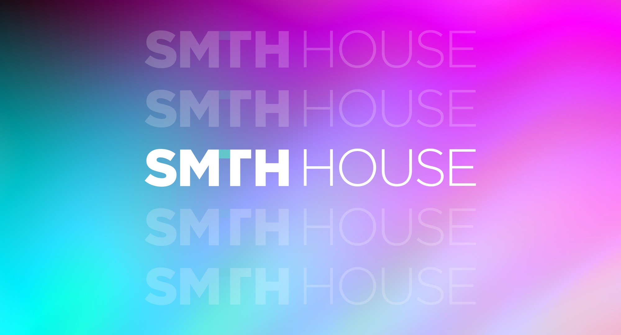
People like visual puns. We like being surprised by a graphic that has more to say than we originally thought. (This is why "Smith" in our logo has a hidden "I". People dig this stuff.)
Take a look at this campaign button below from 2008. What visual puns can we find?
- The lower red swoosh looks like a horizon, and the American flag stripes within the "O" also look like rows of crops. Obama was not the first to use the "O" with the rows of crops. The City of Chandler, Arizona, has done it for quite sometime.
- The negative space at the middle of the logomark also looks like the bright sun.
- The top of the "O" looks like the sky, but look at it again and it's an arch, maybe a rainbow that bounces across the horizon. I looked into this, and his campaign called the the "skybow."
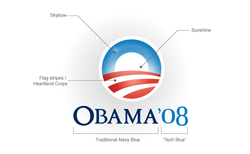
In a single logomark, Barack Obama had three visual puns. Three! Most candidates are lucky to have just one! But because of the perfection of the letter "O" and the brilliance of designer Sol Sender, Obama grabbed up three.
Summary: Winners and Losers
When you consider these three remarkable attributes of the Obama campaigns, it's nearly impossible to recreate this kind of success.
- Color - I believe that in coming years, we'll see more "Tech Blue" in campaigns, but they'll have missed that magic moment when Facebook and Twitter were redefining the universe. It looks like for this campaign, Hillary is leaning toward Tech Blue and the others are playing it safe.
- The Perfect Letter - If you are a politician and you are lucky enough to have an "O" as the first initial of your name, you'll be panned as a copy-cat if you use it to define your campaign. And for this upcoming election, nobody has an "O" so it doesn't matter.
- The Perfect Sequence of Letters - In the current moment, we have 4 or so candidates who have a name defined by an odd-number of characters.
- HILLARY
- SANDERS
- TRUMP
- JEB Of these four, only TRUMP has a central letter that is symetrical--the "U". So he's the clear winner here.
- Visual Puns - Who today has visual puns? Rand Paul and Scott Walker have some mojo here, especially Walker. But at last check, he's going heavy handed on the "E" as an American flag in way too many places. So yeah, really JV here.
Who will win their party's approval? Who will win the presidency? Who knows? But I predict that nobody in my lifetime will have a campaign brand as good as Barack Obama. Nobody is that lucky.