Smith House Logo Square
  • Home

    1

  • Video Resources

    2

  • Services

    3

  • Blog

    4

  • About Us

    5

  • Contact Us

    6

Socials

Youtube LinkedIn
  • Skip to main content
  • Skip to footer

Crossfit Branding

November 2, 2015 By Smith House

2,991

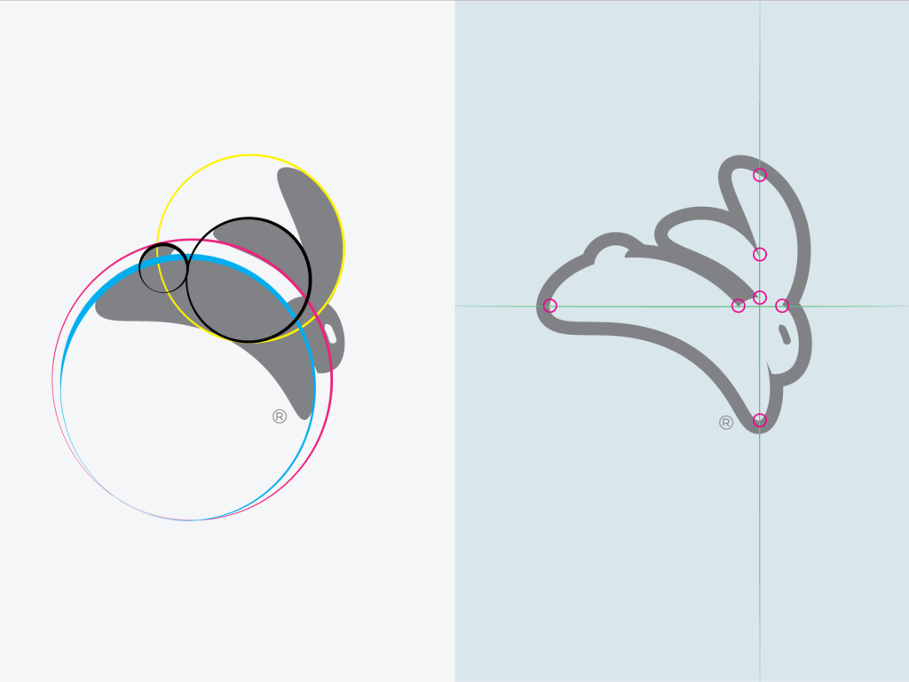
“Can you make a rabbit look cool? It would be a major fail if you came up with something like Bugs Bunny.”

The CLIENT

THE STORY

Jackrabbit is a startup that creates innovative athletic equipment for the crossfit world. Their first product–a high intensity jump rope–was in development when they came to us. They were eager to establish their company with a great product and a branding system that set them apart from others rushing to the market.

THE PROBLEM

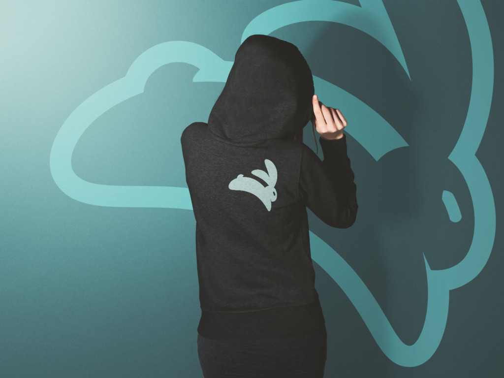
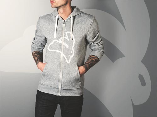
The company’s logo should look good on their first product–the speed rope–but look even better as the company built new equipment and launched an athletic clothing line.

Crossfit is a popular way to exercise and get in shape, it is still a grassroots movement. However, there isn’t a clear design aesthetic that says “THIS IS CROSSFIT.”

Jack Rabbit Crossfit Branding, Branding System
We leveraged geometry and grids to tighten up our concept. On the left, we used a series of circles to give basic form to the logo. On the right, you can see how we used a grid to line up key details in the outlined version of the logo.

THE SOLUTION

It would have been much easier to create a “tough guy” brand for Jackrabbit. But instead, we created a logomark that was classically cool . Something that would look at home on a running shoe, an old pair of soccer shorts, or stitched onto a polo shirt.

Filed Under: Design

Footer

Recent Posts

  • So Here’s Something… May 9, 2024
  • The 1960s and the Golden Age of Automobile Advertising January 26, 2023
  • What if the Future of Social Media Feels Like Cable TV? November 17, 2022
  • Vintage Stripes are Having a Moment October 20, 2022
  • COVID’s Lasting Impact on the Workplace is… Good. June 8, 2022

Most Viewed Posts

  • 6 Reasons Why LinkedIn Sucks. As Told Through Memes. (48,119)
  • Models for Predicting the Future: Geoffrey Moore’s “Crossing the Chasm” (36,885)
  • The New Logo from Instagram Marks the Beginning of the End of “Flat Design” (26,965)
  • Reinventing an Icon: 3 Lessons Learned from the New Converse Chuck Taylor II (25,145)
  • 18 Years Later: 10 Ironic Things About “You’ve Got Mail” (22,534)

Copyright © 2025 · Smith House LLC · 201 E Southern Ave #108, Tempe, AZ 85282 · Find Us on YouTube · Submit Website Error