THE STORY
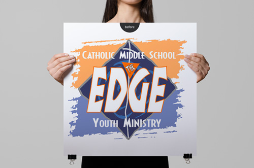
The year 2007. Edge is ministry model for middle schoolers that started at a single church and had spread organically to 300 churches. When Life Teen Inc. acquired Edge, leaders were debating the value of the existing Edge logo. The young people involved in Edge were indifferent, but their adult leaders generally favored the existing logo.
“People already like the Edge logo. Can you clean it up? Make it glossy?”
(BAD IDEA)
THE STORY
The year 2007. Edge is ministry model for middle schoolers that started at a single church and had spread organically to 300 churches. When Life Teen Inc. acquired Edge, leaders were debating the value of the existing Edge logo. The young people involved in Edge were indifferent, but their adult leaders generally favored the existing logo.
THE SOLUTION
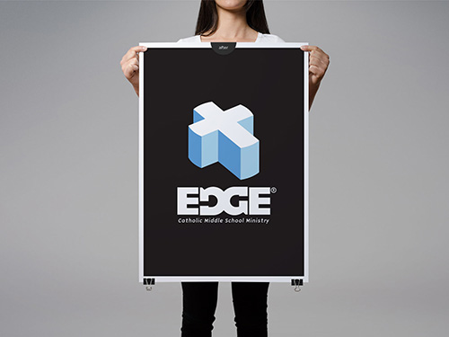
We campaigned to create logomark that appealed first to youth. Win the affection of the youth and the adults will learn to love it. Through our discovery process, we learned that middle schoolers were charmed with board sports, gaming, and the new wave of electronic gadgets. The new look and feel of Edge needed stand confidently next to brands they already loved: Apple, Tony Hawk, and everything from Nintendo and Playstation.
STATIONERY SET
- Logomark, logotype
- Variations: horizontal, vertical, with and without subtitle
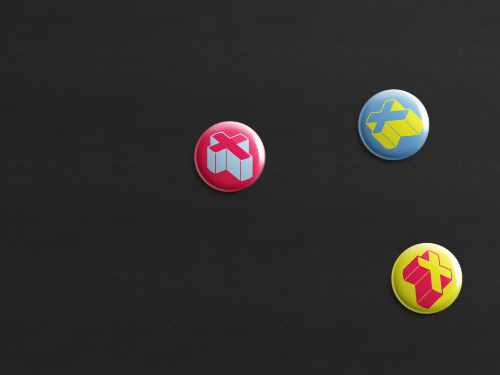
- Full color, single color
- Maintain visual integrity even when colors are remixed (see pins)
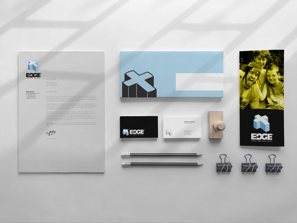
STATIONERY SET
- Business cards
- Letterhead, envelope
- Brochure mockup
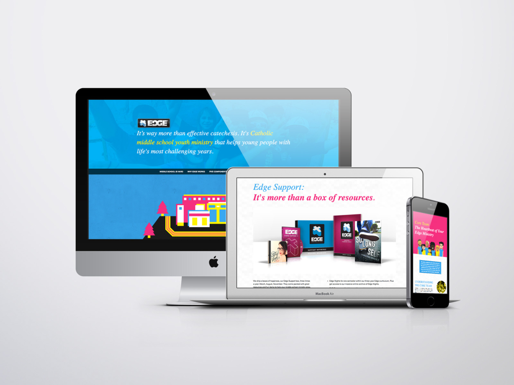
MARKETING + INFO WEBSITE
- Responsive, mobile-first
- Design, copywriting
- HTML5, CSS3
- SEO
The website has since been replaced. See our website design archived here.
Before 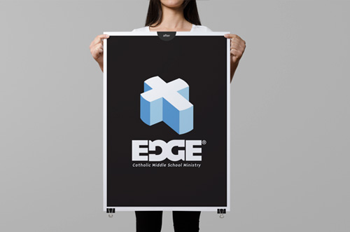
After

