THE STORY:
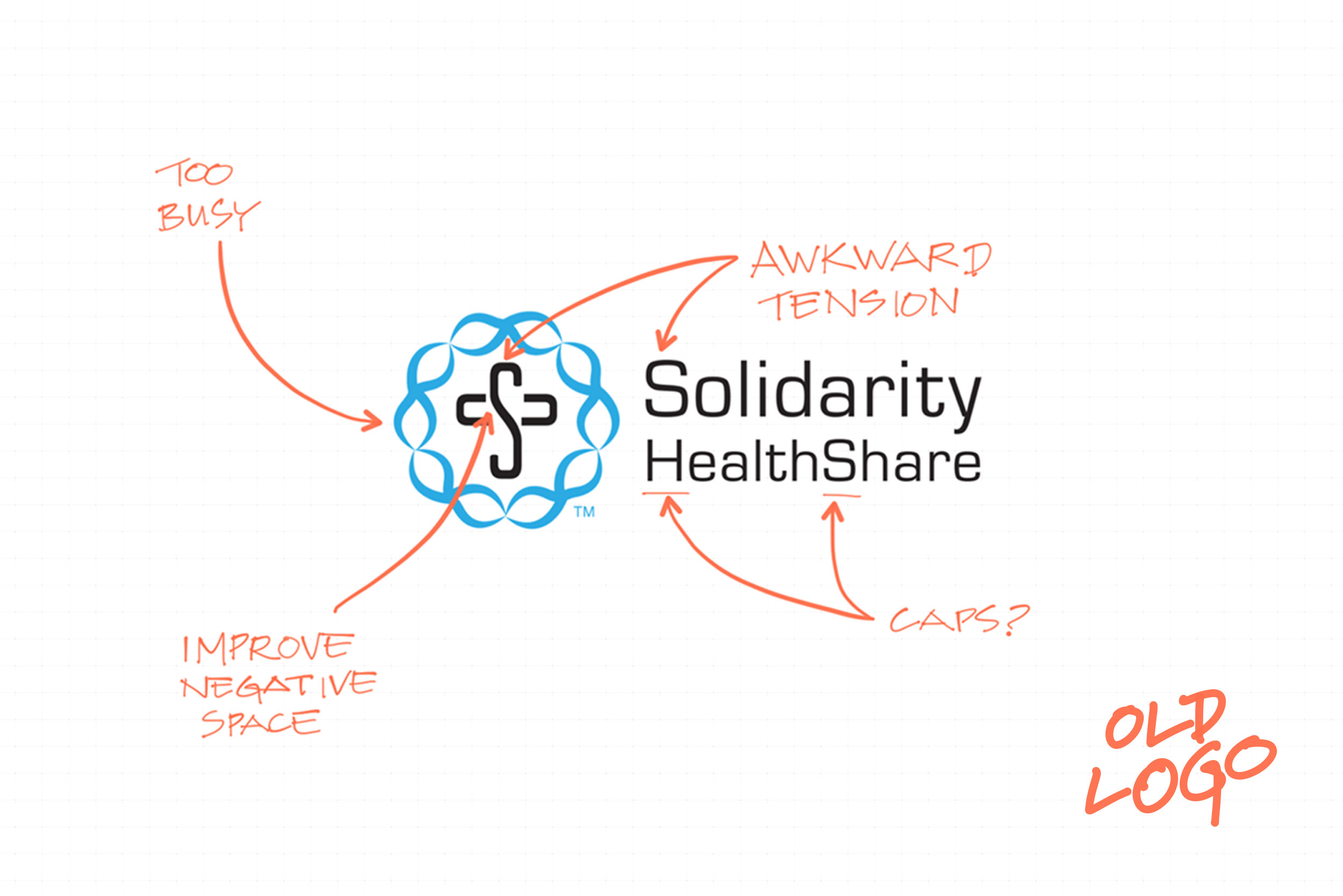
Dr. John Oertle and Chris Faddis, co-founders of Solidarity HealthShare, approached smithHOUSE for a visual upgrade for their startup. Their original logo had served its purpose in the organization’s first three years, but it was showing signs of weakness as Solidarity had grown.
THE PROBLEM:
The existing logo had gained traction with early customers. So the revised logo should not be a major departure from the existing logo.

THE SOLUTION:
- Removed the circle of rosary beads to allow for more focus on the cross-mark.
- Changed the composition of the logomark and wordmark to relieve the visual tension. As it was, the “S” in the logomark from the “S” in the word “Solidarity” were too close, and it was obvious that the S’s weren’t the same.
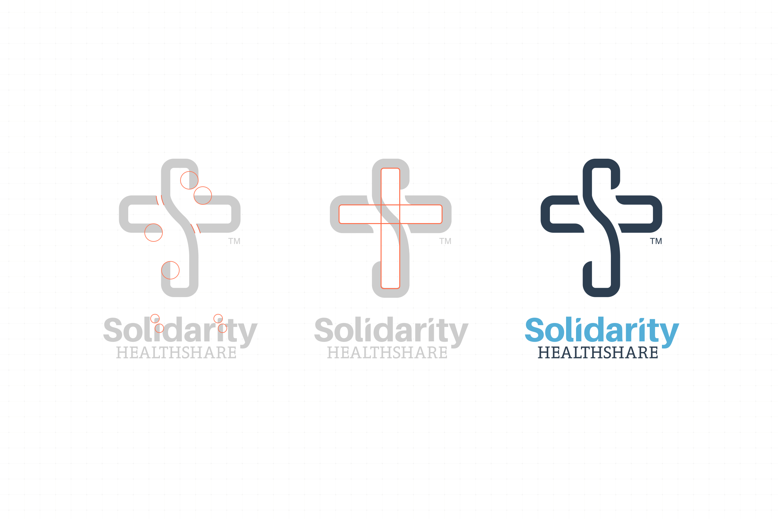
- Refined the negative space so that it more clearly suggested the Christian cross.
- Radiused the forms within the logomark to create more energy.
- Radiused the I’s in the word “Solidarity” to be in harmony with the revised logomark.
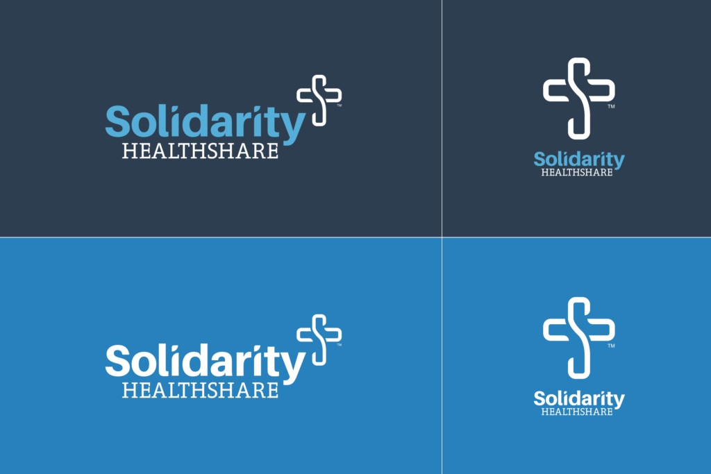
- Upgraded to a full branding system. Now the organization has multiple configurations (horizontal, vertical, logomark only, etc.) in multiple colors (light, dark, monotone.)


