I took a drive with my family around our favorite parts of Phoenix over the weekend. My conversations with my wife (also a designer) are pretty fierce. We see things that we love, and we also see things that drive us crazy.
I took note of the good and bad, and I decided to put it all into a blog. In part one of this blog, we'll look at what is failing and offer some solutions.
1. All These Realtors and Their Yard Signs

The Story:
One out of every four people in Phoenix is a Realtor. This includes Senator John McCain and the Arizona Cardinals Quarterback Carson Palmer. Just kidding, but if you live in Phoenix or Scottsdale, you swear that everyone you know is a Realtor.
The Problem:
Real estate agents love their names, their faces, and their signs. On a casual drive down the street during prime selling season (the summer), you'll see dozens of tacky real estate signs along the street.
The photo above may be from California, but it's something that we see too often in Arizona too. Obnoxious signs sprout up like weeds on a street corner.
But do they have to be so tacky? So cheesy? So overwhelmed with info?
The Solution:
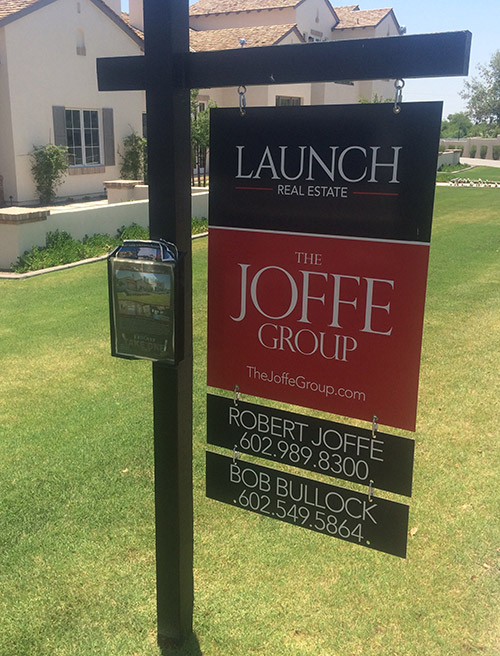
One agency that's getting it right is Launch Real Estate. I don't know them, but I have seen their signs and they're gorgeous. When placed on your front yard, it makes your home look more handsome.
What's their secret?
- They know the difference between a sign and flier. A sign should help brand the home as valuable, and it should also grab a home buyer's attention. Most real estate agents believe that the only way to grab attention and "capture leads" is to put tons of information on the sign. But when everyone is yelling, nobody is heard. Put all the extra information on the paper flier that is attached to the sign post. That stuff doesn't belong on the sign.
- They use blank space. Notice above how Launch Real Estate has a lot of blank space that is either red or black. So whatever words sit comfortably within that space are easier to read.
- They focus on color and typography. Translated: they hired a good designer. You can't fake this stuff!
2. The "Arcadia Lite" Neighborhood
The Story:
Arcadia is the gem of The 85018. Unlike the uber luxurious Paradise Valley with its gated entries, Arcadia is a classic neighborhood for people who like to get out and do stuff. Jog and ride bikes. Play in the yard. Listen to dads compare their vintage Porsches.
The Problem:
The less pricey neighborhoods south of Arcadia and west of Arcadia were searching for an identity. Everyone is buzzing about Arcadia, but what about us?
The neighborhood on the south took on a simple and authentic nickname: Lower Arcadia. I have no idea when this happened, but it happened. And everyone seems to like it.
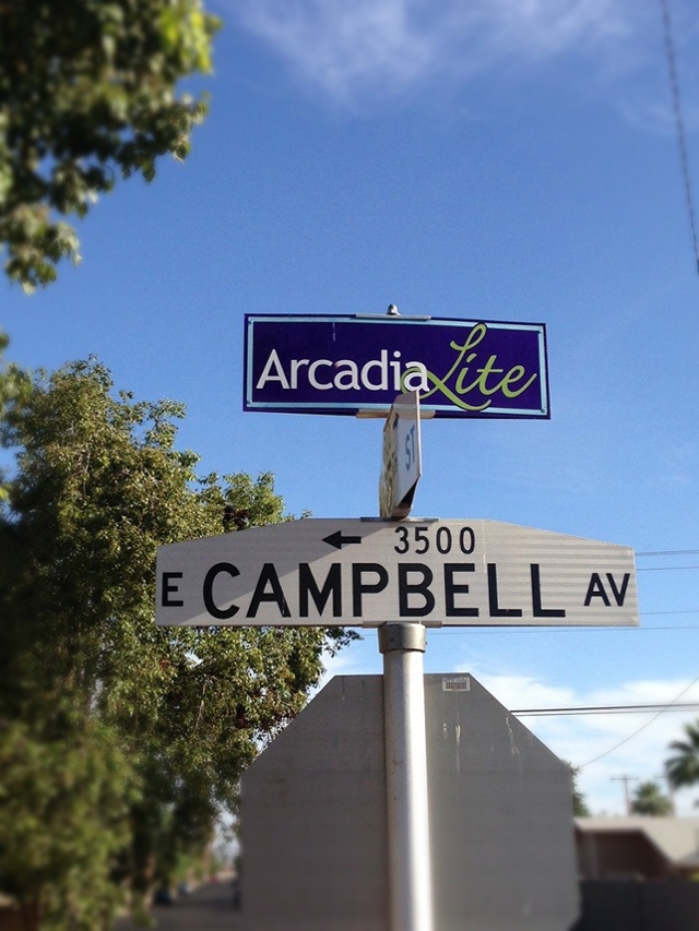
The neighborhood to the West of Arcadia wasn't as cool about it. They decided to call their neighborhood Arcadia Lite.
ARCADIA LITE! This is the most insufficient name you could ever assign to a neighborhood. By choosing the qualifier "lite", you are aligning yourself with watered-down beer from Budweiser and Miller.
Bud Lite!
Miller Lite!
It's beer but it is not as good. It's Arcadia, but it is not as ______.
The Solution:
I know that it's too late to change the name: it's perched on top of the street signs and Realtors love to say it way too much. We have to accept that this is what most people call it.
But you don't have to! Call it "Near LGO" and everyone will know where you live.
3. The "Ambassador Manor" Neighborhood Sign
The Story:
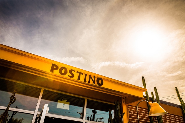
So speaking of "Near LGO," Ambassador Manor is a neighborhood directly south of the famous La Grande Orange Cafe, Postino, and Ingo. Everything is perfect along 40th street except...
The Problem:
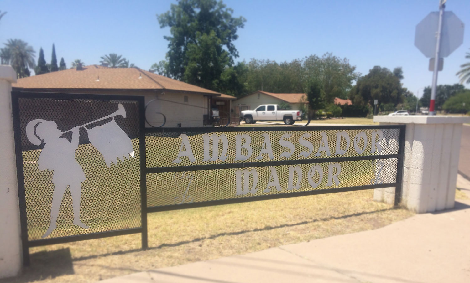
The Ambassador Manor community sign at the entry looks terrible. I mean, look at it! The little guy with the trumpet and the feather in his cap make me think that I'm at the Renaissance Festival. (See it on Google Street View.)
I just can't understand how this sign actually made it through. Is there something that I just don't understand about the world? Was there a time in American history where people said,
"You know what's cool? Robin Hood and Men in Tights. Let's put something cool like that on our neighborhood sign."
It's too bad. The Ambassador Manor neighborhood is just steps away from all the coolness at 40th and Campbell, yet it just doesn't look right with that fanciful name and awkward sign.
Would you even know that behind that entry sign are cool ranch houses with large, irrigated lots?
The Solution:
You have some legit options here. Unlike Sherwood Heights (the other Robin Hood neighborhood) near Papago Park, Ambassador Manor is not yet registered as a historic neighborhood. So you still have the flexibility to change things up. Here you go:
- Change Your Name - I don't like it when neighborhoods are named after some lofty ideal or far-off paradise. Could we be a little more humble? Authentic? Local?
- Change Your Sign - Reach out to a few design schools over at Arizona State University and tell them about your problem and that you need a creative solution. This is the kind of stuff that professors love. Why not let their students submit concepts and renderings? I'm sure that some talented students in the schools of architecture, industrial deign, and even graphic design would love to show you a solution. Or you could contact us and we'll get the job done for you.
4. The Camelback Corridor
WTH is a corridor? Have you ever dreamt about hanging out in a corridor? Working in a corridor? Living in a corridor? I have no solution here. I just have to point this out so that we can be annoyed together. And promise me that you'll skip this name and instead call it "The Biltmore" or "East Phoenix."
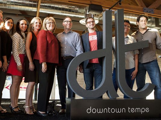
5. Too Many D's: DT, The DC, and DTPHX
The Story:
So the city of Tempe kicked up the campaign to rebrand its core. The city used to be known for its strip of bars and restaurants on Mill Avenue. But today, you can wine and dine as far west as Farmer Arts (Culinary Dropout) and as far East as College Ave (Snooze, Postino, etc.)
In 2014, "Mill Avenue" was deleted and replaced by Downtown Tempe or DT for short. (Photo credit: AZCentral.com)
The Problem:
I don't know who got there first, but it's clear that this whole D-thing is getting out of control. Downtown Chandler wants to be called The DC and Phoenix wanted to be called DTPHX. It's all starting to feel contrived.
The Solution:
For the creators of these new monikers, know that I'm not a hater. I understand that you would have preferred that your citizens come up with cute and cool names. And then you respond to the wave by adopting it as your own to show that you are cool like that. (See ATL)
So it's on all of us to come up with a solution to this problem. If you love your part of town, be proud of it. Brag about it. Talk about it. Give it a nickname! Hashtag it!
Need ideas? Check out our side project: SouthTempe.org and on Instagram with #southtempe.
Branding Phoenix: 5 Winners
Later this week, I'll hand out cool points to all the people and places that are strengthening the brand and culture of our city. We'll look at their successes and see what we can learn from them.
