I am obsessed with logos. Most people glide through their day with their eyes skipping around signs, ads, and storefronts and think nothing of the logos. Me? I get really emotional. I want to clap when I see good design. When I see bad logos, a little part of me dies.
Through it all, what baffles me the most is well-respected companies who hang on to their logo when it is CLEARLY holding them back. In some cases, they fancy themselves as having a legacy, so they keep the awkward logo because it means something. In other cases, they figure that it's just too late in the game, and they are afraid that a rebrand will end up like the Gap debacle or Tropicana blunder. Who knows?
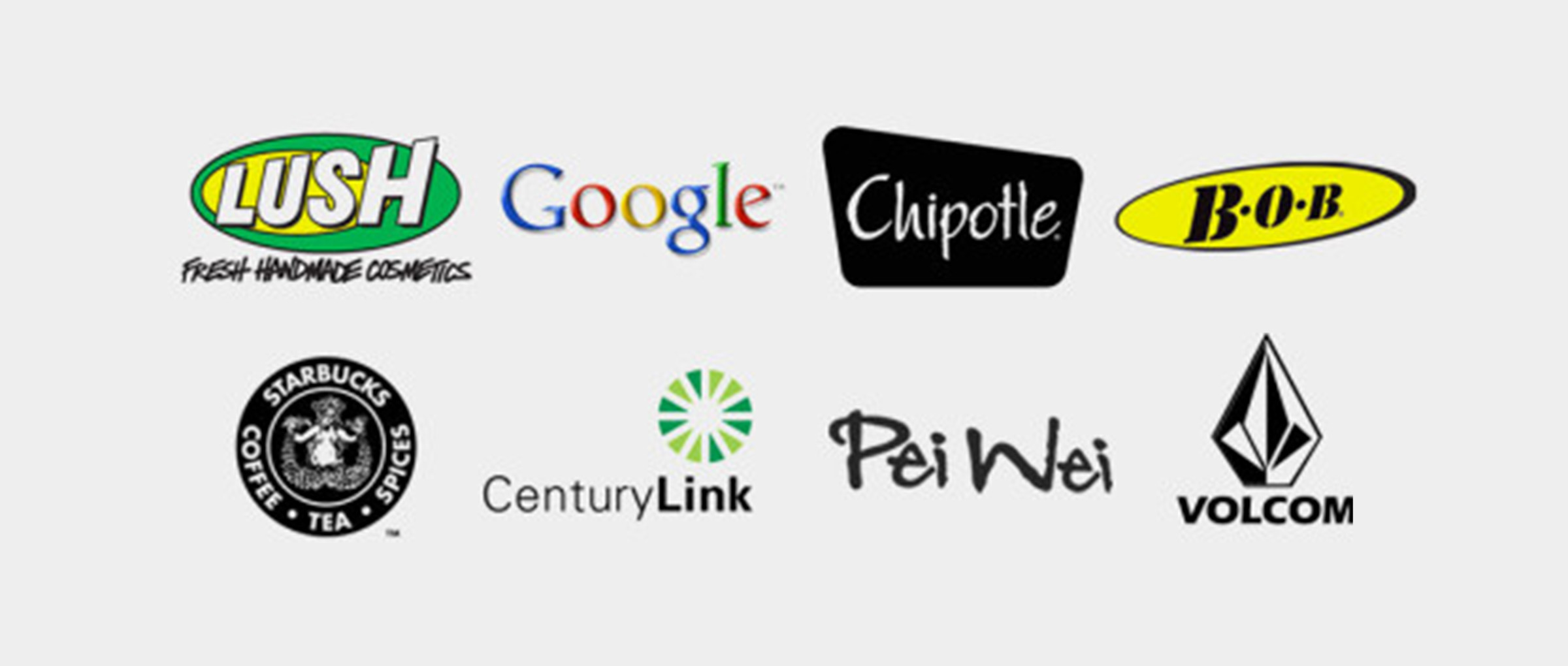
This is what I do know: these 8 companies had logos that are underwhelming at best. Let me tell you why this bothers me.

1. Google
G-O-O-G-L-E. Yes, those are big, powerful letters. Because Google owns the world, we want to believe the story of founder Sergey Brin whipping up a logo that was intentionally different. You know, like a rebel! You could search on Google and they would confirm this for you, but they can't be trusted.
The real story probably went like this. "We need a logo by lunch". Out of spite, the designer threw something together in MS Word with obnoxious primary colors. She was trying to make a point: if you want fast, you don't get good. The web guy thought that it was funny too, so he posted it to the website.
Six hours later, Google had beat Yahoo as the best search engine. By then it was too late to start over. Sometimes success happens too fast.
It looks like it was designed by a 7th grader for a school project.
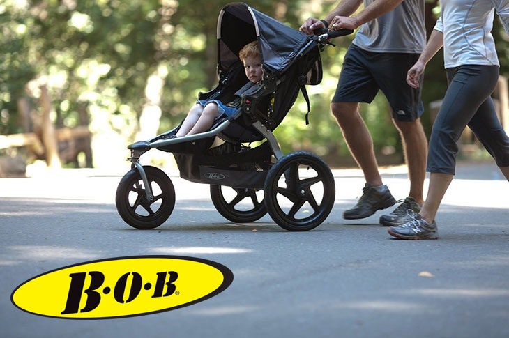
2. BOB Strollers
For all the childless readers of this blog, let me take you to school. When you are single, it's important to be fit and hot. This is why you put on that clean little running outfit and lace up those sporty shoes and then run through busy places so that people drink up your fitness.
Well, all that hard running pays off. You meet THE ONE.
Then comes love, marriage, and baby carriage. And for all the sporty parents, how do you stay fit and hot? With a BOB Stroller! Everyone wants them!
These strollers are so coveted that they hold their value that makes even Honda Civic owners jealous. Buy it for $500, sell it three years later for $499.
So BOB, whoever you are--I love your stroller. I'm a fan. I own two. But why the goofy logo? Call me when you are ready to be the best you.
3. Starbucks
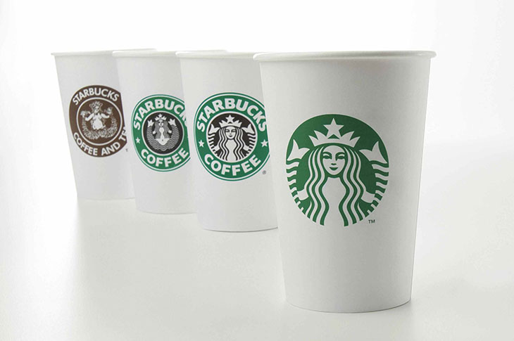
Most of us never even think about it. Why would you want to? A mermaid doing an impossible yoga stretch with her fins and all? WEIRD! We just drink up the coffee and carry on with our day.
There's no question that Starbucks is a strong company, and their branding today is comprehensive and admirable. But they've had to work hard to overcome their awkward beginnings.
4. Lush Cosmetics
I was at the mall with my wife on Mother's Day. She was at Anne Taylor Loft, and I was entertaining our daughters outside of the store in between Anthropology and Lush. Anthropology is too bo-ho for me, but they have a great vibe that you just have to respect.
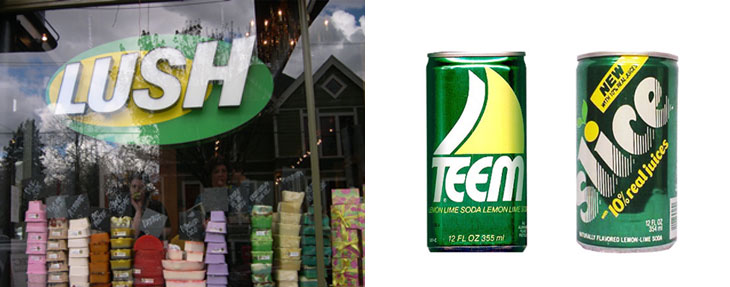
Lush, on the other hand, has a forward leaning product--handmade natural cosmetics--with really cool interiors. When you walk through the store, it's like a field trip of consumerism. What I can't figure out, though, is how Lush has such a shockingly lame logo. I wanted to take a photo of it because I would have to put it in this blog, but I couldn't stand the thought of that logo polluting the beautiful photos on my iPhone.
Their logo looks like a generic brand of lemon-lime soda from the 1980s. This makes me sad.
Update: Lush Cosmetics has a new look. The logo has finally caught up with their products. But why did they hang on to that lamo logo for so long?
5. Pei Wei
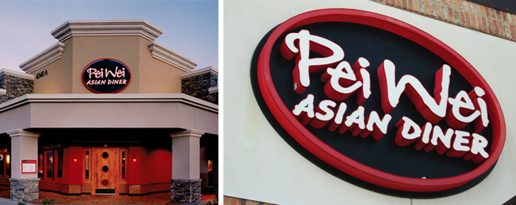
Here's the thing about typography. If it's meant to look hand-written, then the letters shouldn't all look the same. Take a look at the "e-i" in both "Pei" and "Wei." Those letters SHOULD NOT LOOK THE SAME. It looks artificial. Boo!
The good news is that Pei Wei is rebranding their stores, but there are so many left with the old logo. What do I think of Pei Wei's new logo? Its typography is obvi inspired by the message from a fortune cookie. And it's paired with a graphic of a free-spirited human who has an empty stomach that longs for Honey Seared Kitchen.
6. Volcom
Volcom is a board sports company based out of Southern California. It started in the 1990s and grew steadily in the way that lifestyle brands do. Then in 2011, it was acquired for $608 million. Not a bad payday for a couple of skaters, now is it?
Great story, but I can't help but wonder if they would've been acquired sooner or for more money (like how Nike grabbed up Hurley) had Volcom not been dragging along that bizarre logo.
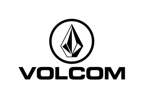
Their logomark looks like it was sketched on the back of a notebook by an 8th grader who loves primitive weapons like spears, bows, and arrows. Nothing here says surf, skate, or snow. I guess this is what happens when you try to rebel against the rebels (Quiksilver, Billabong, O'Neill) and you end up with oddity.
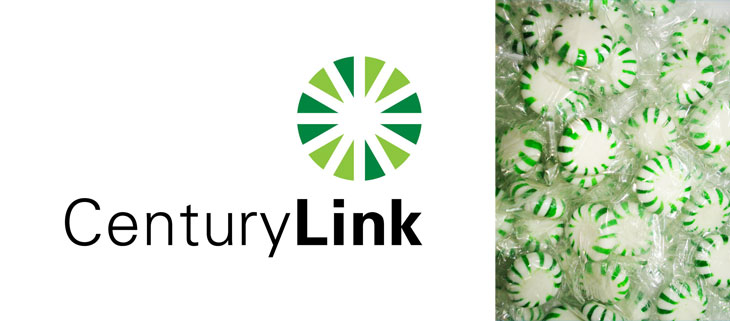
7. CenturyLink
I have no understanding about this company. They came to my house to try to get me to dump my internet service provider. I saw their logo and I handed back the brochure. What is this, a piece of candy? Are you the Willy Wonka of ISPs? Boo! Get away from my house.
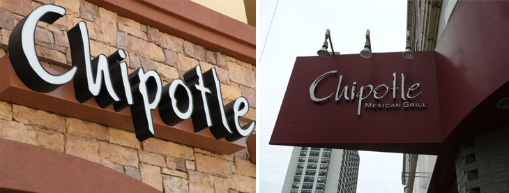
8. Chipotle
Here's the undisputed leader of the "fast casual" restaurant revolution: Chipotle. It seems like every day I read something nifty about Steve Ells and what he's doing with the company and changing the planet or something. I'm a fan.
But Steve, why that lame logo, bro? Those hand-written letters. Couldn't you have tried a little harder? It's such generic non-conformity. That look had been done by every college-town burrito stand through the 1980s and 1990s. Couldn't you have come up with something to move it all forward, just one step?
On a practical level, because the "t" and "l" are so similar to one another, many in suburbia called you Chipolte. Chi-pole-tea. smoked jalapeno pepper that defines your culinary POV, then you are sure to lose cool points.
Lessons Learned
1. Branding Matters. It's easy to point to these 8 companies and point out that they're all successful. So, clearly, good branding can't be critical for success. Don't forget that there are 1000s of companies that didn't make it, and their clunky branding was a part of what dragged them down. Also, there is a long list of companies whose excellent branding supersedes their actual products.
2. Rebrand today before you get too big. You will save a lot of money and money, and you'll minimize drama.
3. Invest in yourself and hire a smart design agency. A good team of designers can help you address those thoughts that are stuck in your head:
- What if our product mix changes?
- What about when we open up to a new market? How can we appeal to two distinctly different customers?
- How do we look cool without looking like we are trying too hard?
Psssst. We can help too. Contact us and let's create something great together.
