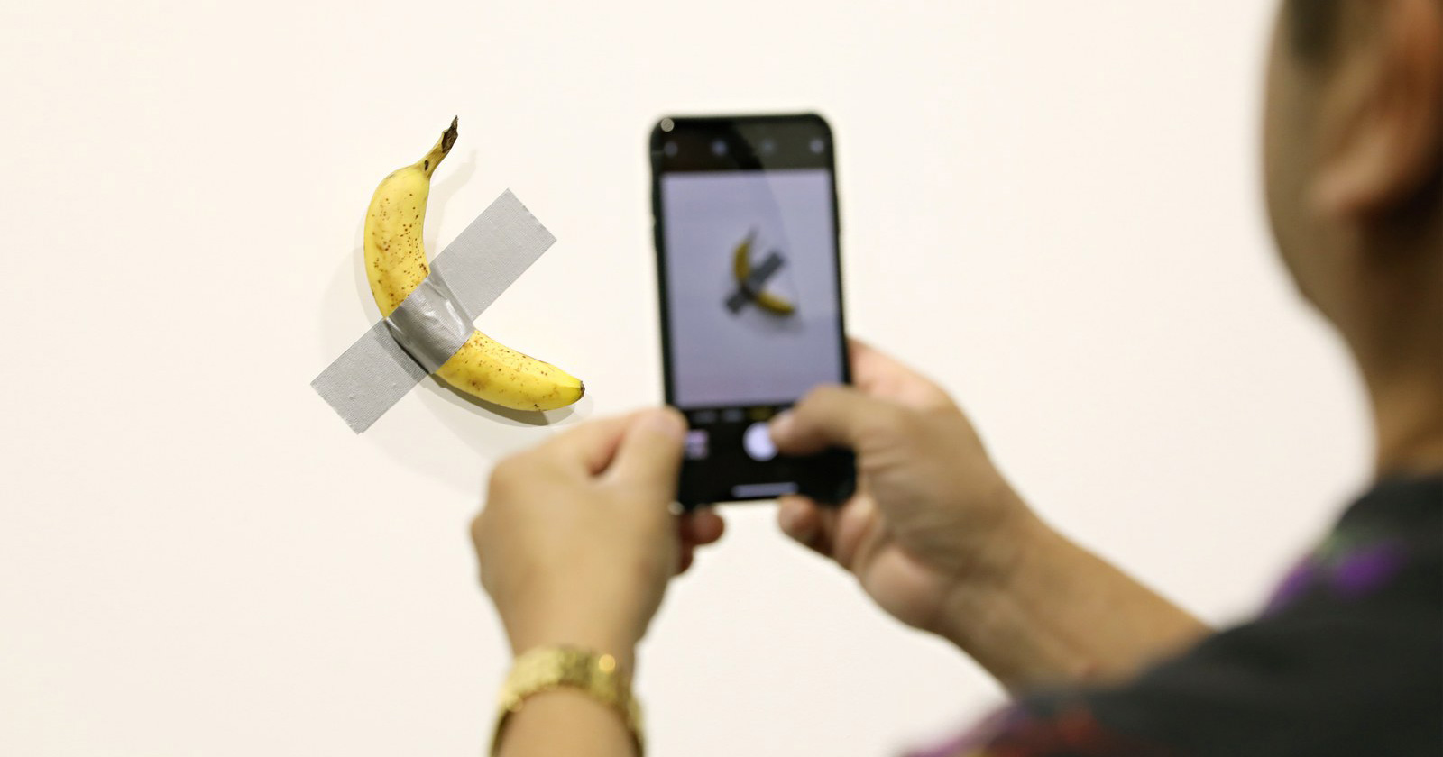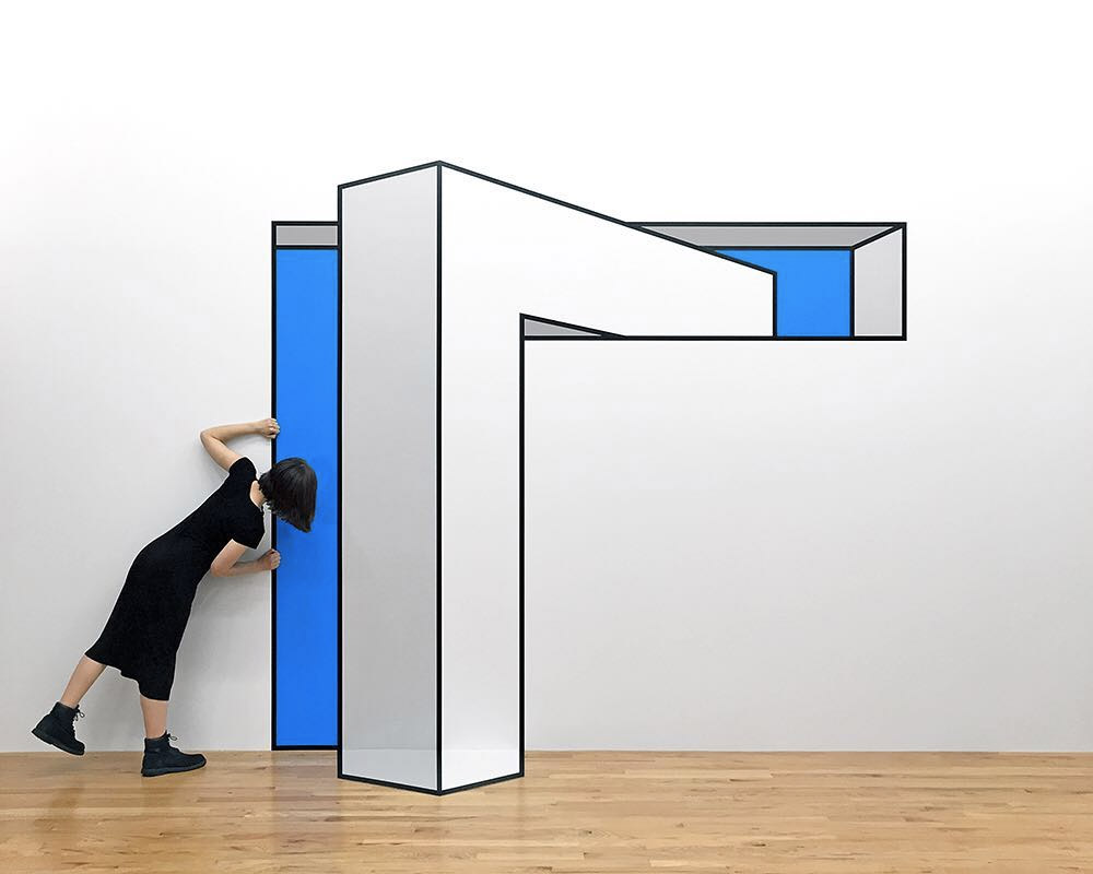
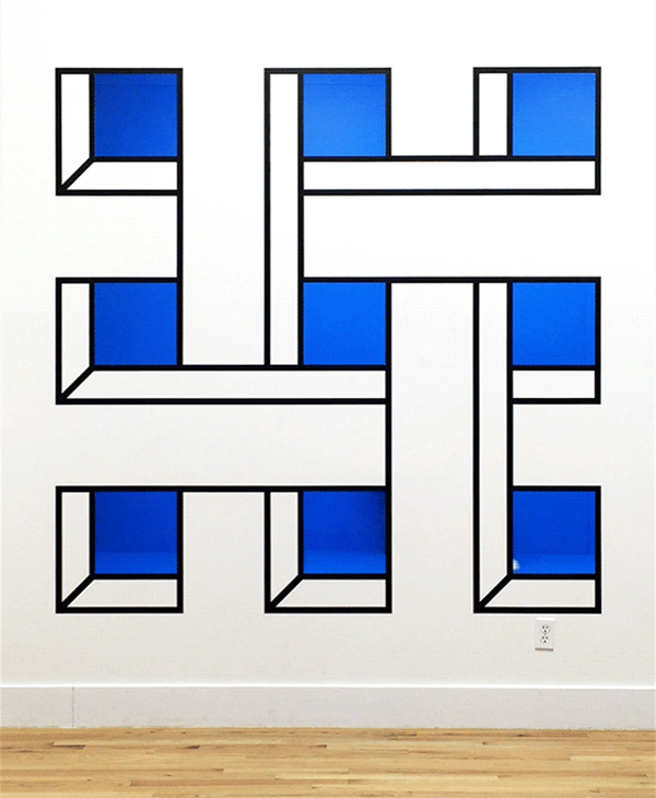
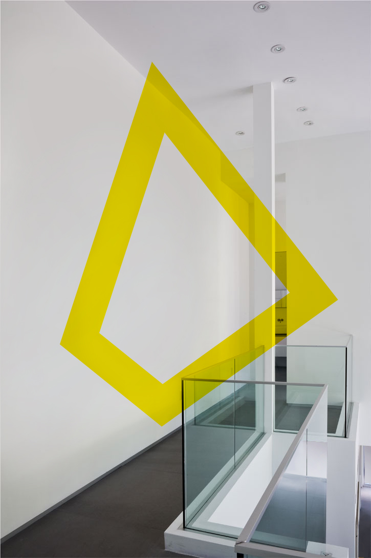
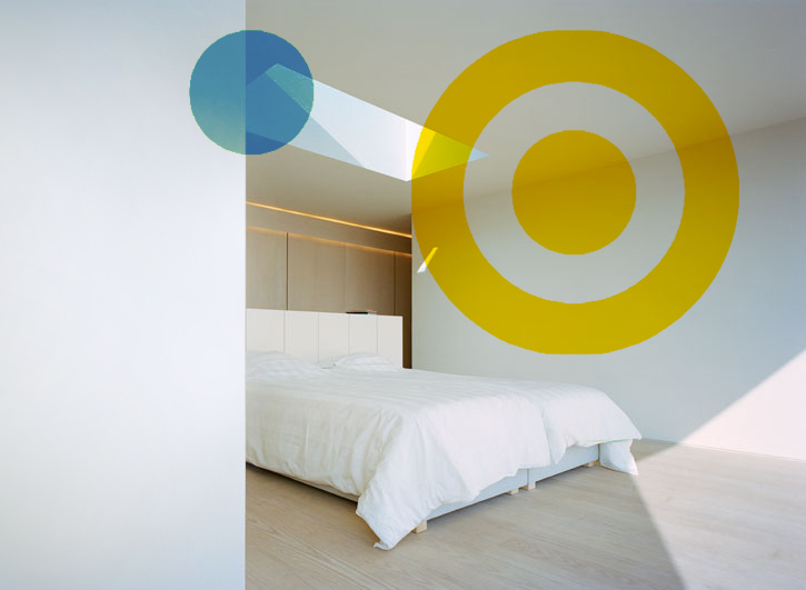
Using Tape to Create Minimalist Illusions
Using only tape and a couple pops of color, the artist Aakash Nihalan is able to do playful work on boring white walls.
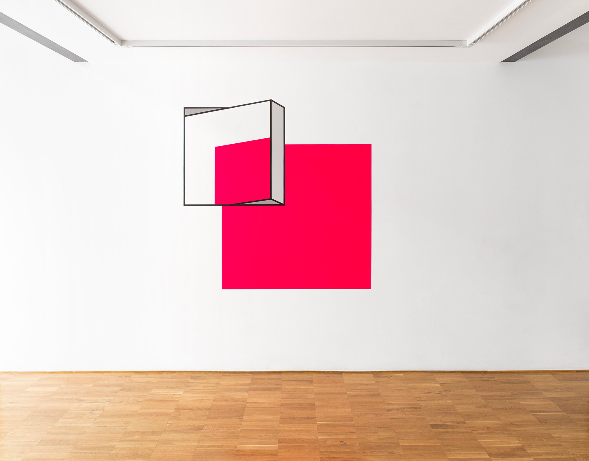
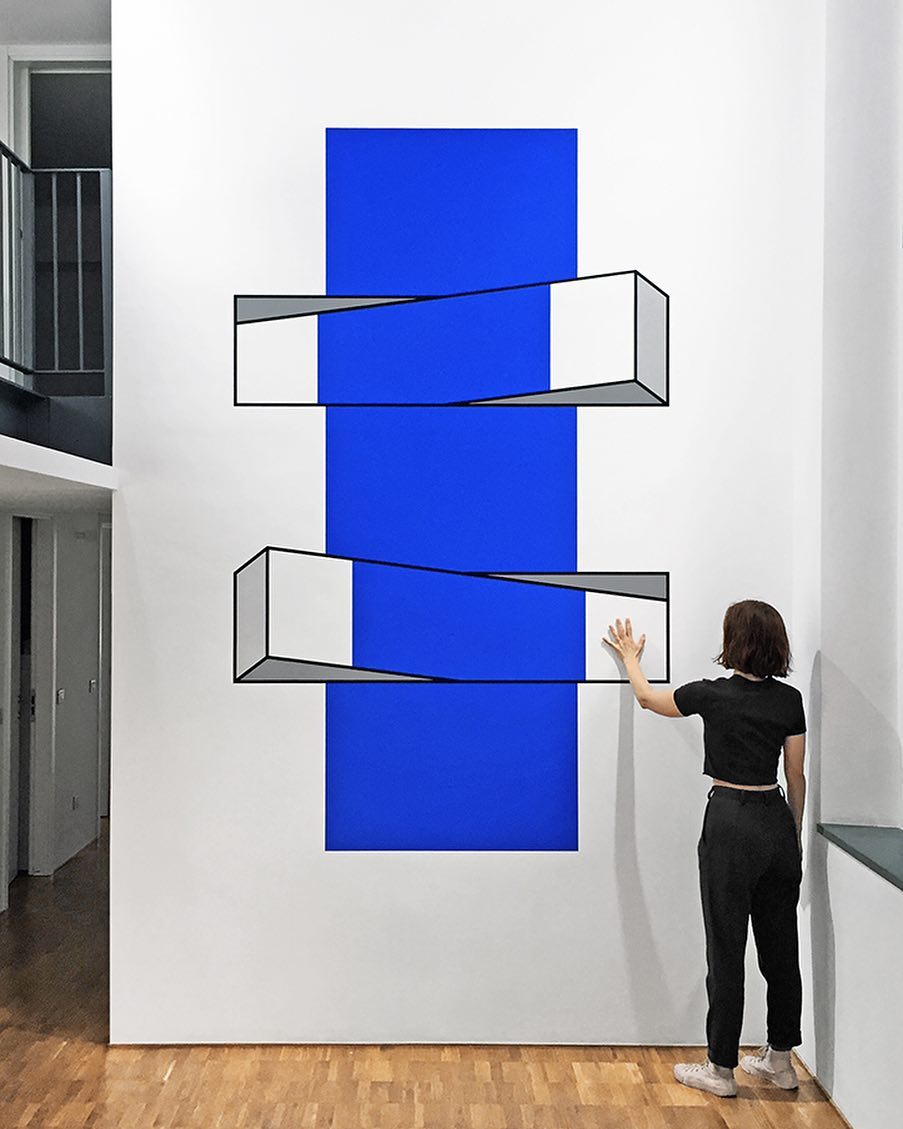

Now, look away from your screen. Likely you are in a room with four walls, boring white walls. I see opportunity!
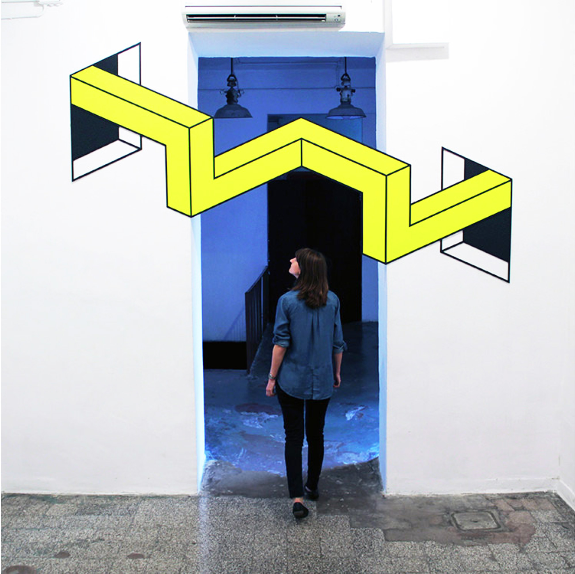
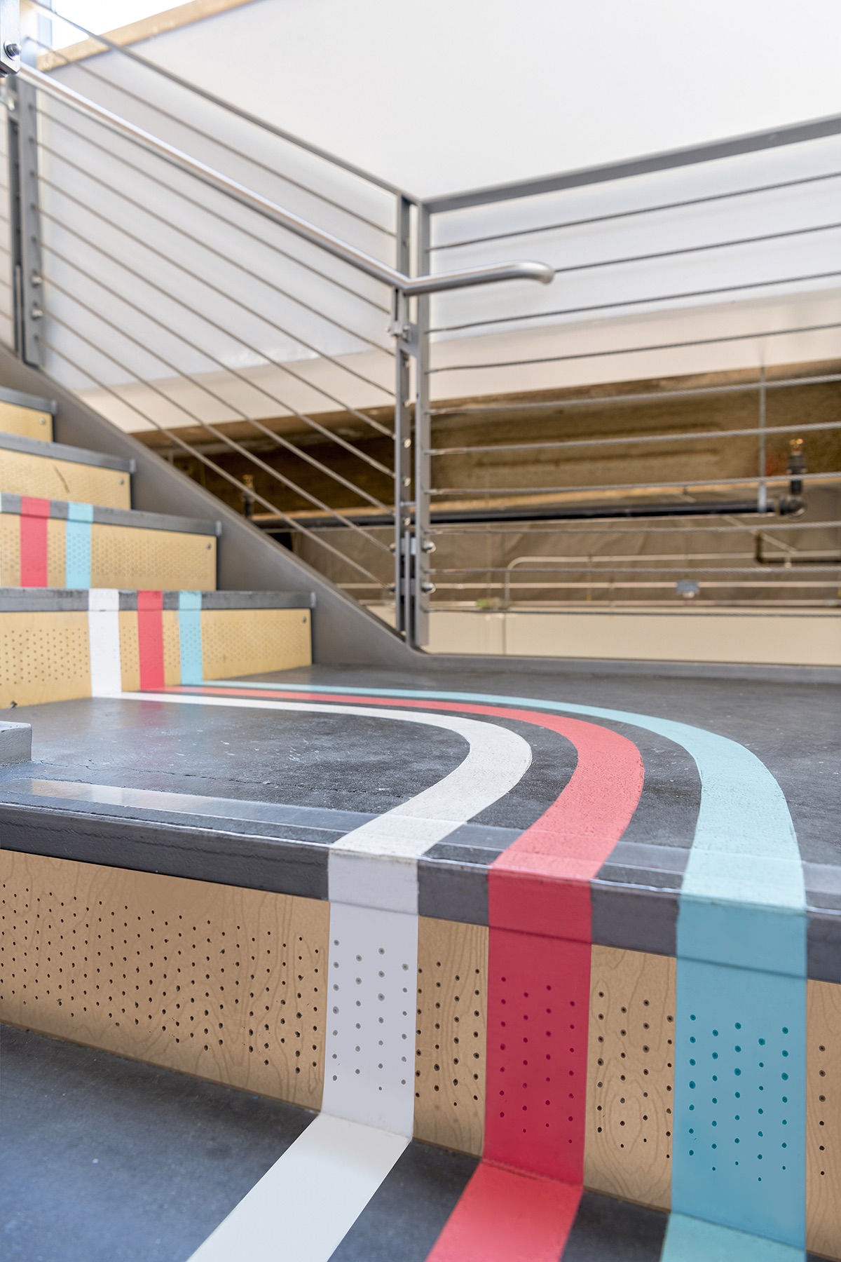
Anamorphic Murals

These murals are trippy. Walking through the space, the walls are splattered with chaos of random shapes. Nothing makes sense until you enter the "magic spots" when the shapes align. ?
This illusion would be fun for boring, lifeless corners of parking decks and the staircases that move you up and down. Even better if it's your company logo!
TRY IT: I don't want to say this would be easy, but I think with a digital projector, it's doable! Find an area with layers of planes and intersecting shapes. Project your logo and watch how the light traces over the three dimensional objects. Outline it with chalk, buy three similar tones of paint. You got this, right?
Wayfinding at the DoorDash HQ
First of all, did you know that wayfinding is a thing? These design specialists help us make our way through intense and overwhelming places like airports, subway systems, and large campuses. They use simple tools of signs, arrows, colors, and words to steer people in the right direction... When they do their job right, we don't even notice. We arrive at our gate with ease in time to make our flight.

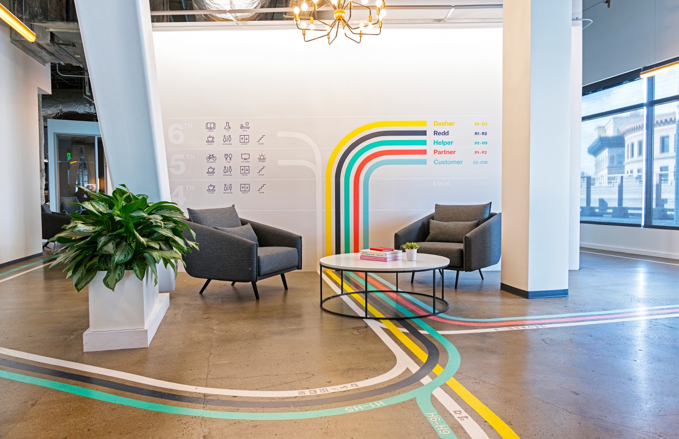
I came across DoorDash's design for a company HQ... these stripes went on the floors and walls in the quiet months when they were a relatively low-profile company. Then in spring of 2020*, DoorDash has become a household name because they allowed us to enjoy food from our favorite restaurants in the safety of our homes.
I can't see much from these photos, but it appears that the wayfinding stripes took inspiration from subway maps to help guests to their office find their destination. "You are here to meet with the product team? They're waiting for you in the conference room. Follow the teal stripe."
What makes this special is that DoorDash is in the logistics / delivery business. The success of their company is dependent on drivers quickly finding their way through cities to deliver hot meals. Fun, right?
Also, there's some magic in the DoorDash logo, design lessons that I share in a recent video:
Amazing Yet Terrible Placemats
I applaud these designers for creating clever placemats. The placemat seems to bend under the weight of the plate, knife, and force. Looks great on the shelf at the MOMA store, but probably would make me dizzy and nauseous at my dinner table. Likely I would second-guess my life choices.
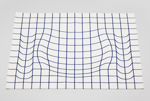
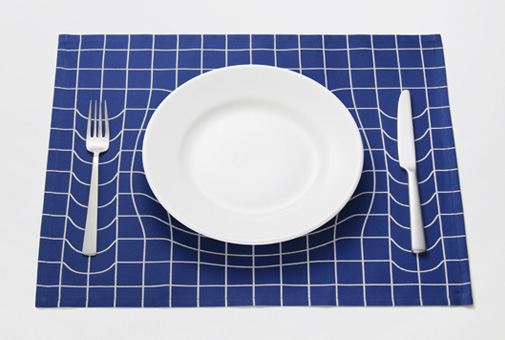
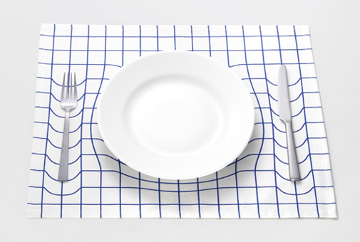
Source: http://apworks-product.jp/
Cartoon Backpacks and Purses
From their website: "The designer plays with graphics and illustrations to create real-world bags that literally look as if they jumped from paper. The bold two-dimensional appearance of each bag is guaranteed to turn heads and serves to bring joy and fun to the mundane. From shoulder bags and backpacks to purses and wallets, every design pops with color and personality."

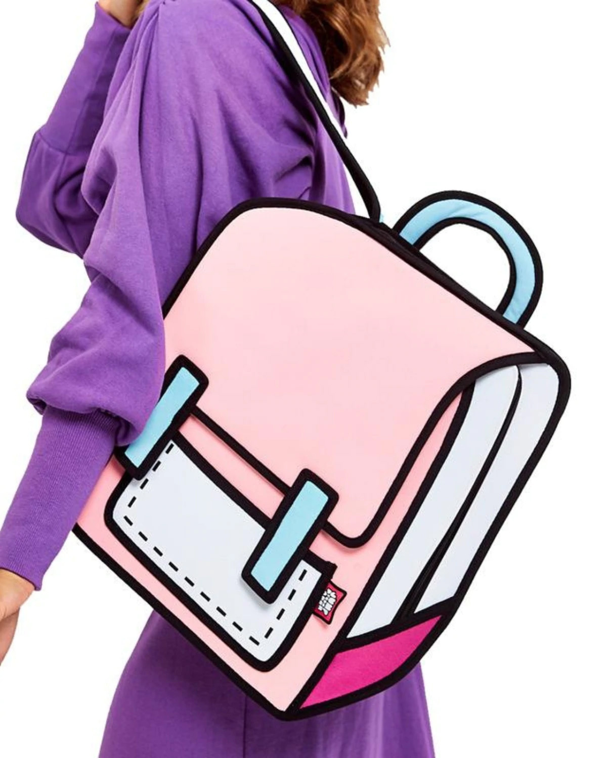
Source: JumpFromPaper
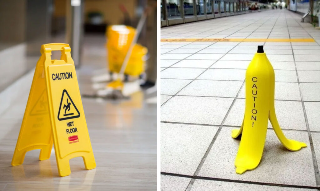
Caution, Wet Floor!
We've all seen the wet floor sign. Maybe it makes you walk with caution, maybe you ignore it altogether. But seeing a big slippery banana? ? ??♂️ Maybe that will get you to slow down!
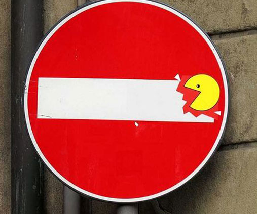
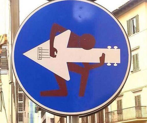
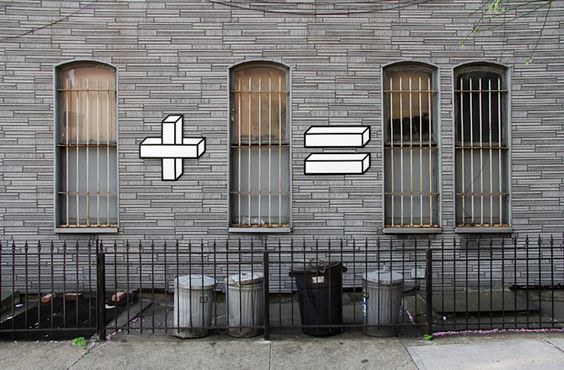
Street Art
Here's some gritty stuff in public spaces and dirty streets. Remixing street signs is most definitely a crime, but isn't it adorable?
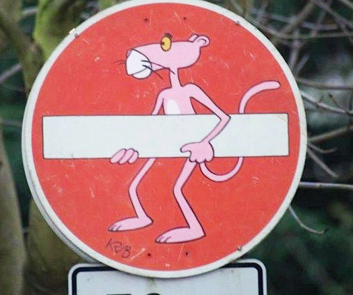
What I love about this next one is how the artists brought something whimsical into an otherwise miserable spot: trash cans, bars on the windows, and litter and weeds on the ground. The artist used a similar technique as we've seen in earlier examples up the page--cartoon purses and tape art.
If you made it this far in the blog, you may want more! I'd encourage you to listen to an episode of the 99 Percent Invisible podcast where ordinary citizens remake city signs as a public service, even if it is illegal. ?